Music discovery radio service, Pandora has rebranded itself hoping to transform its millions of free listeners, into paying customers for their ad-free premium service. With a brand new logo and digital campaign push, designed by their very own creative team, Pandora seems optimistic about reaching their future production and success goals.

Vice President of growth marketing at Pandora, Lisa Sullivan-Cross, spoke about the company’s rebrand saying, “It really reflects the change of the product and declares to everyone that there is something new and different and exciting happening at Pandora.”

The new wordmark incorporates all lowercased letters with curves that make it unique from its old design. Now using a white background and a top-heavy “P” for Pandora’s app icon, the music giant has made itself look modern and more dynamic.
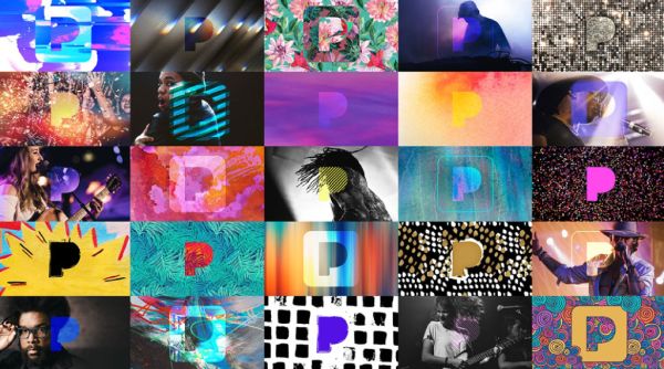
Sullivan-Cross continued by talking about the new logo’s color, by saying “It isn’t just blue anymore. We are using it in really interesting ways. We are creating these living and breathing music experiences. Our new logo does that in a way our old one didn’t. It is a window into that musical experience.”

To read and discover more behind Pandora’s new identity, and to see its new rebrand video, simply click here.