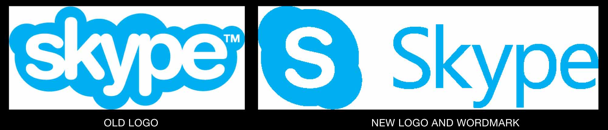
During Skype’s rise to saturation, the brand’s wordmark has been contained in a cloud. Microsoft has brought the design back down to terra firma with a new design that strictly aligns its recent acquisition to other MS products.
The new design is certainly more elegant, in terms of spacing, typeface, and presence. But for such a personal product, meant to bring people face-to-face, it feels sterile. The cloud-S icon survives for now.
The play-out of the new identity, however, feels creative and enabling. DesignWeek has a thorough overview of the new identity at https://www.designweek.co.uk/issues/12-18-june-2017/skype-rebrands-logo-bringing-line-microsoft-windows/.