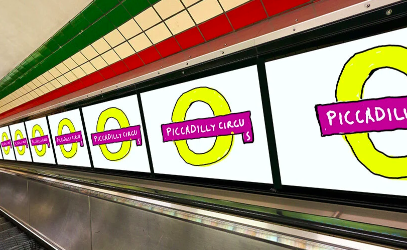
Artist David Hockney did not charge one cent for his recent re-creation of the familiar Piccadilly Circus tube station roundel, but many Londoners still feel they did not get their money’s worth. Created as part off a publicity campaign founded by the mayor of London Sadiq Khan and titled “Let’s do London,” Hockney’s raw, unbalanced design for the public installation has locals wondering if they have been roundel-ly had.
https://www.designboom.com/art/david-hockney-london-tube-design-05-14-2021/

An oversized W is at the center of Wembley Stadium’s new identity, created by Landor & Fitch. Appropriately called the “big W,” the logo’s shape can easily be stretched or constricted and still be recognizable as an identity marker and initial letter.
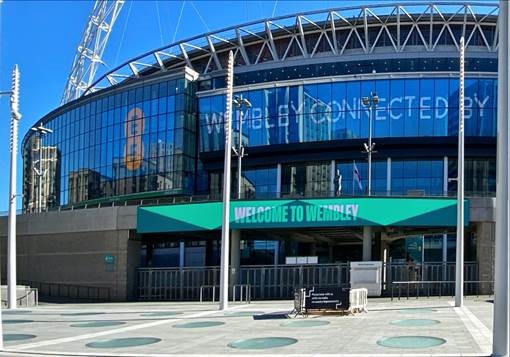
The design firm built the new identity on the strapline, “It matters more at Wembley,” underlining the fact that the historic and iconic facility is regarded as truly special by performers and audiences alike.
https://www.transformmagazine.net/articles/2021/wembley-stadium-debuts-bigger-than-ever-rebrand/