Floral brand FTD has a newly refined identity, created by Base Design and RoAndCo, that is intended to underline its status as a heritage brand. In addition to proclaiming its founding date of 1910 as part of its logo, the new plan is built on a base of olive green, a color that serves as a neutral and appropriate backdrop against which to showcase floral products and other FTD gifts.
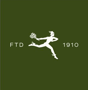
The company’s familiar “Mercury man,” its mascot since 1914, had a modest makeover as well. His hands and feet were enlarged to make them in better proportion to his body, and his musculature was altered to make him look more like a Roman god.
"The goal of this rebrand was to reimagine the giving experience for today's consumer and put forward creative and branding that feels modern and focused, while staying true to the legacy of the brand and FTD's place at the forefront of the floral industry," says FTD's chief creative officer, Annelies De Rouck.
Base Design and RoAndCo Studio are also involved in the ongoing rebranding of ProFlowers and ProPlants, both of which are properties of FTD.