Design agencies Public Address and Works Collective were brought in by FIFA to create the logo and brand attributes for the 2023 Women’s World Cup Australia and New Zealand. The logo they created brings together 32 squares to represent the 32 nations that will compete to appear at the event.
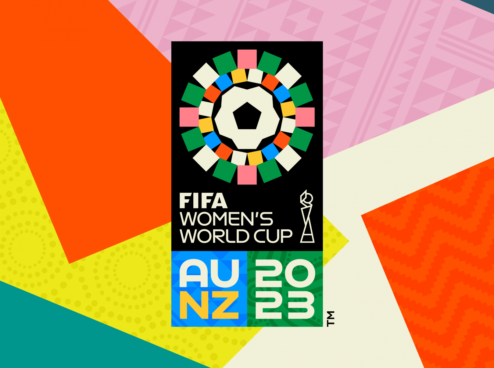
Vibrant colors and traditional patterning, inspired by the Australian and New Zealand flags as well as their physical landscapes, creates a brand that is very centered on very specific geographies.
https://www.creativeboom.com/news/2023-womens-world-cup-australia-new-zealand/
• The National Women’s Hockey League has rebranded as the Premier Hockey Federation. Removing gender from the title felt long overdue, explains commissioner Ty Tumminia.
“We felt it’s time for our players to be defined by their talent and skill,” explains commissioner Tumminia says. “It’s not like they’re female phenomenal. You’re just phenomenal.”

From a PHF document describing the new logo, “The PHF crown symbolizes power and prestige, especially that of the athletes skilled enough to be crowned Isabel Cup champions. The stars forming the crown represent our talented and accomplished athletes, while paying homage to the NWHL’s original logo.”
https://nhl.nbcsports.com/2021/09/07/nwhl-rebrands-to-premier-hockey-federation-entering-7th-year/