![]()
• SodaStream has a new logo and identity, created by design firm Pearlfisher. SodaStream is a maker of a beverage-carbonation machine that helps consumers create fizzy drinks at home.
From a Dieline article: “The wordmark appears in a new typeface, and the logo finds inspiration in the ripples positive change can usher in. Two water drops are arranged in a Yin-Yang pattern, forming an ‘S’ for SodaStream.”
The circle shape of the logo pulls from the button that users push to start the machine.
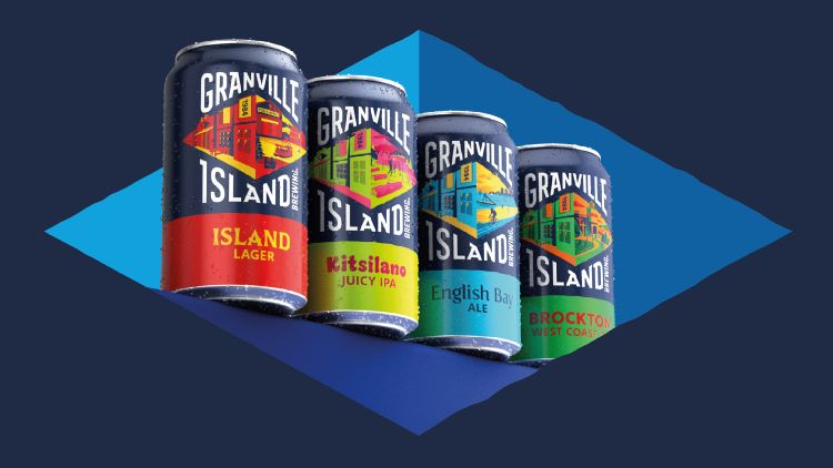
• At nearly 40 years old, Granville Island Brewing was the very first microbrewery to set up shop in Canada. It now has a new logo and identity, created by BrandOpus.
BrandOpus designers were interested by the energy of the “do-ers, choose-lifers, and seekers” of British Columbia, where the brewery is located. Each beer variety now has its own distinct illustration and color palette. An elongated diamond shape is split in half, with an illustration of the brewery on the left and an illustration showing a different region and activities on the right. The client’s previous logo was also diamond shaped.
The brand’s new icon is also a diamond, which is sometimes filled solid and sometimes half solid and half empty.