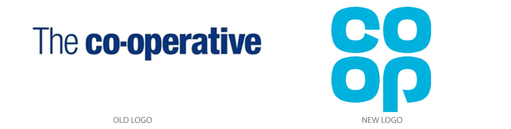
Known as one of the world’s largest consumer co-operatives and the fifth largest food retailer in the U.K. operating overseas, Co-operative Group commonly referred to as “Co-op” today, has brought back its old clover leaf logo. The original was designed in 1968, proving the old saying that “if it’s not broke, don’t fix it.”
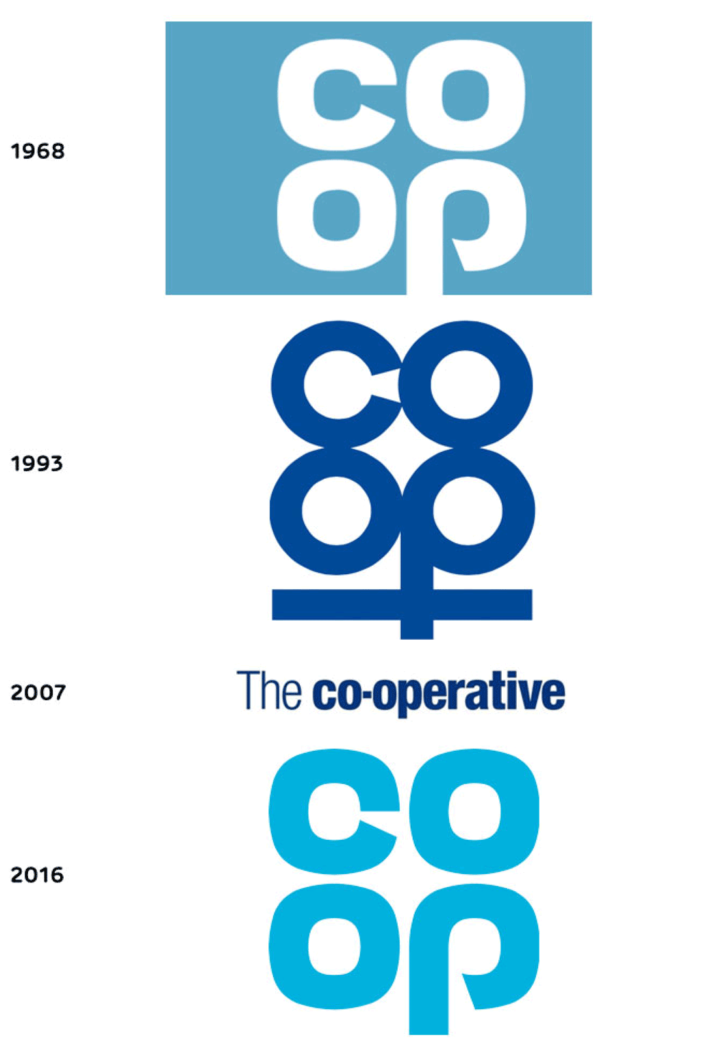
Redrawn from the past, the new, yet old identity was first proposed after the London-based design company, North, researched the Co-op’s profound history and its past identities.
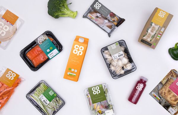
By updating its color palette from a dark navy to a vibrant, more modern baby blue, and by modernizing the logo altogether, North has reenvisioned the Co-op’s classic “clover leaf,” which can now be seen throughout several Co-op food stores.
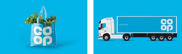
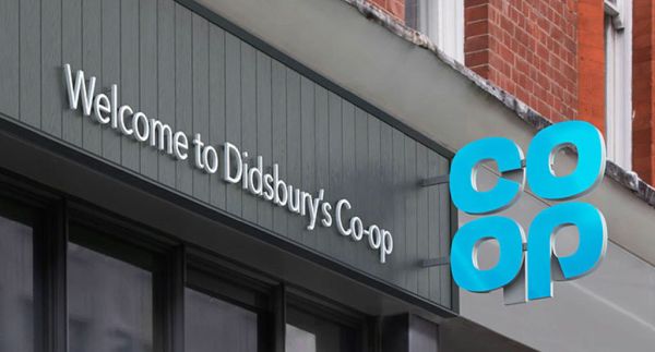
With more than 3,500 outlets, the company said that the newly improved identity of the Co-op may take a few years to appear in every store. However, it hopes to have the new identity displayed everywhere by May 2019, where it will appear on all packaging objects, uniforms and digital media channels.
According to Sean Perkins, North’s founding partner, “Returning to the familiar can be a radical act, but it is the timeless quality of this iconic logo that makes such a move possible it is distinct, recognizable, approachable, and dynamic, giving us the opportunity to signal a shift back to the ideas that made the Co-op special for its customers.”
Read more behind the Co-op’s new identity here.