
• The National Air and Space Museum is undergoing an extensive remodel, including announcing a new logo which dispenses with the prefix “Smithsonian.” The brand was created with the assistance of design/marketing firm Boncom.

From the museum’s website: “Designed to signal the moments of awe that inspire and fuel innovation, which are celebrated through the museum’s experiences, the logomark uses positive and negative space to create a stylized craft that simultaneously suggests both aviation and space flight.”
https://www.si.edu/newsdesk/releases/national-air-and-space-museum-unveils-reimagined-brand
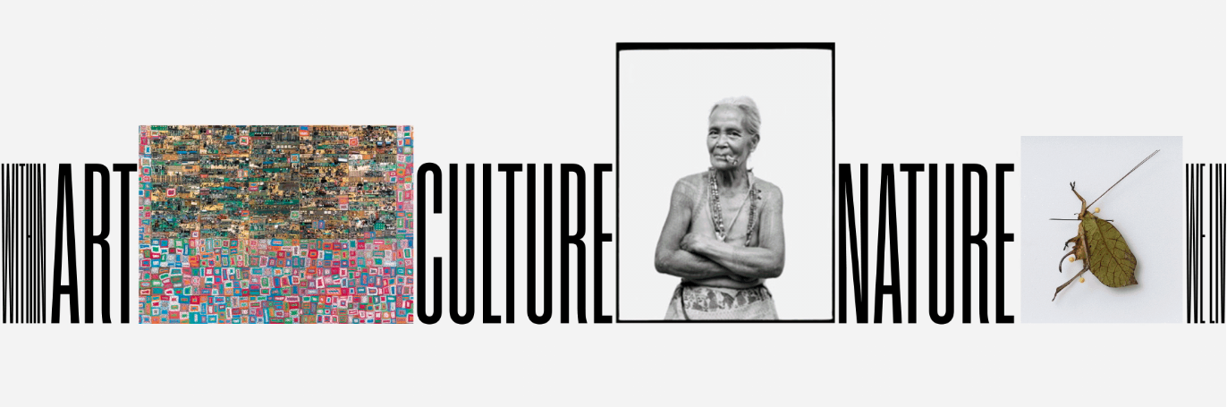
• The Royal Ontario Museum is the largest art institution in Canada. Its new identity, created by Leo Burnett Design, has at its center a very bold sans serif monogram. But in addition to its role as the hub in the museum’s new brand, that wordmark also has a utilitarian purpose: it drives an “immortal timeline.”
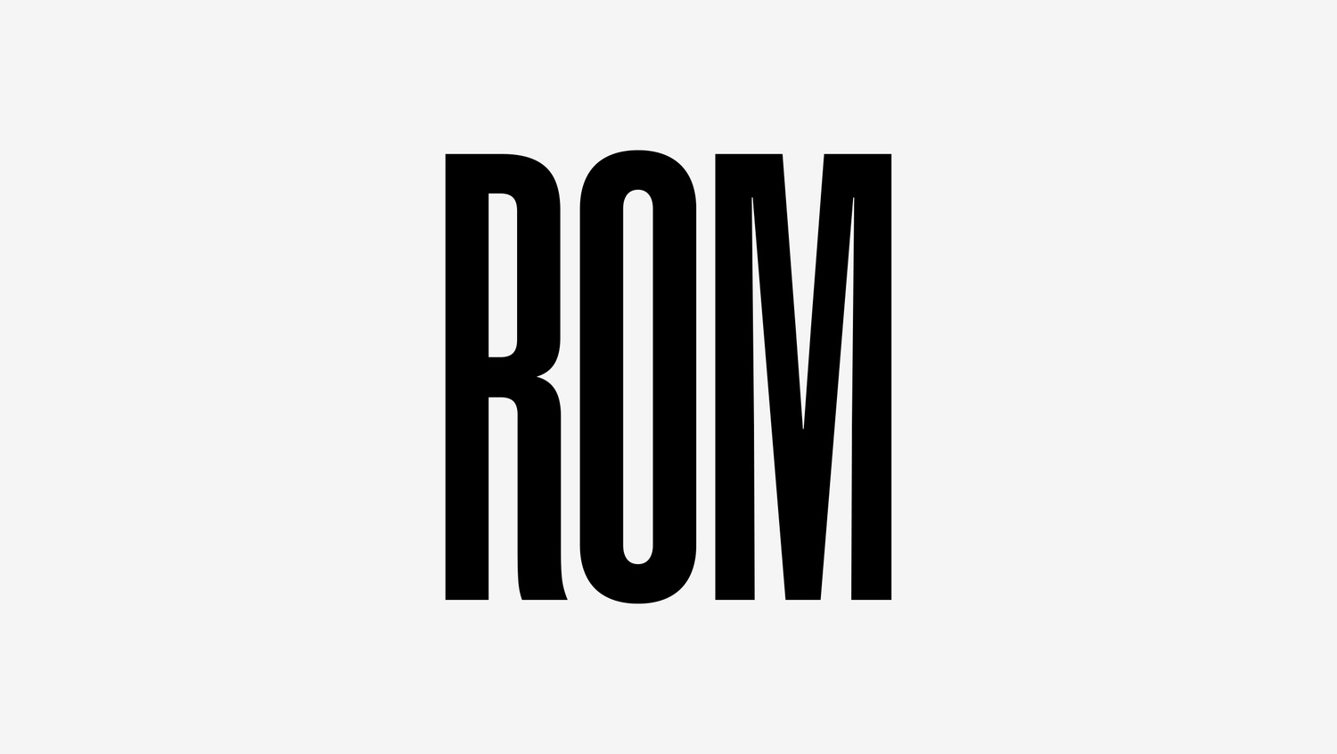
"The museum's 13 million objects and natural history specimens were reimagined as an immortal timeline. It uses a typographic approach that expands and contracts allowing people to immerse themselves into any moment in our history," says Man Wai Wong, VP group creative director with Leo Burnett Design. "The identity is truly timeless, because it captures all of time—past, present and future."
(Also check out the remarkable ROM Immortal brand campaign video, “We Live On In What We Leave Behind,” created by Broken Heart Love Affair at https://www.youtube.com/watch?v=RaiLBV5bW1E.)
https://finance.yahoo.com/news/leo-burnett-design-rebrands-rom-174800618.html