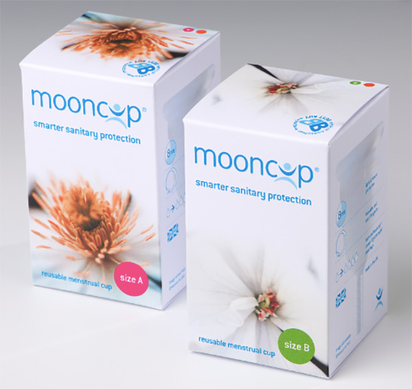
Mooncup is the original menstrual cup, designed to be a convenient and eco-friendly alternative to tampons and pads. The company started as a bootstrap operation in 2002, and although its popularity has grown substantially, its brand identity had not. It felt clinical and subdued, very unlike the flowery, girly identities used by paper-based competitors. But flowery and girly was not at all what Mooncup wanted either.
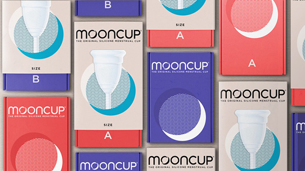
Bluemarlin created a new identity for Mooncup, one which portrays the cup as a intelligent, contemporary lifestyle product that an owner would be proud to use. The new logo and packaging graphics use images of the moon and waves, both of which speak of the environmentally-conscious roots of the product: one study shows that one person with a period will use over 11,000 tampons or pads in their lifetime, all of which—including packaging and applicators—ends up as trash.
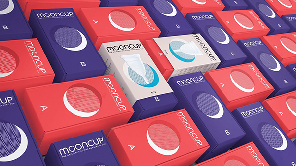
The new designs use brighter colors and simple graphics, including a photo of the product on the box. The result is modern, instantly understandable, approachable, and definitely not subdued.
https://www.designweek.co.uk/issues/25-november-1-december-2019/mooncup-redesign/