A 2016 update to the Mastercard logo removed company’s name from the surface of the design’s interlocking circles. A redesign revealed at the end of 2018 has swept the name away altogether.
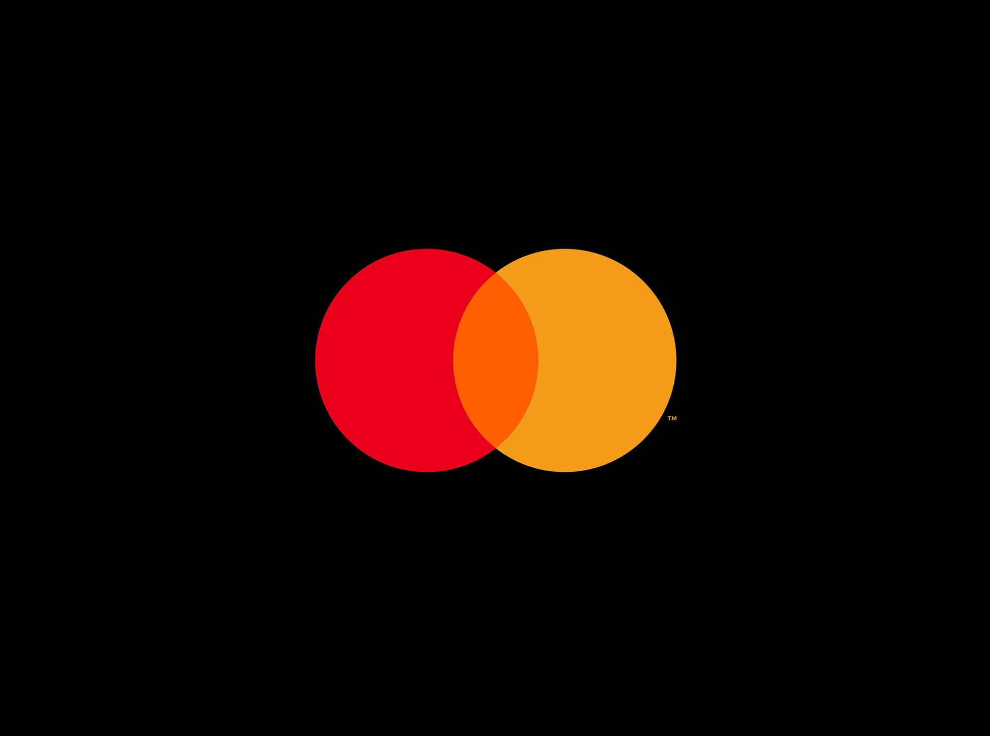
Michael Bierut, partner with the agency of record Pentagram, comments on the redesign. “We live in a time where, increasingly, we communicate not through words but through icons and symbols. Mastercard has had the great fortune of being represented by two interlocking circles, one red, one yellow, since its founding in 1966. Now, by allowing this symbol to shine on its own, Mastercard enters an elite cadre of brands that are represented not by name, but by symbol: an apple, a target, a swoosh. Mastercard’s two interlocking circles have always represented their commitment to connecting people. Now, that commitment is given greater presence by Mastercard’s status as a symbol brand.”
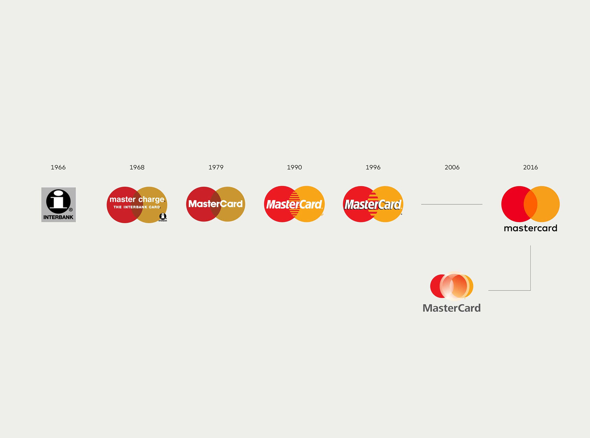
“Reinvention in the digital age calls for modern simplicity,” said Raja Rajamannar, chief marketing and communication officer at Mastercard. “And with more than 80 percent of people spontaneously recognizing the Mastercard symbol without the word ‘mastercard,’ we felt ready to take this next step in our brand evolution.”
Read and see more details here.