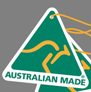
If the new Australian Made logo makes you think of terribly infectious things one would like to avoid, you would not be alone. When the new logo was released recently, critics said it looked like the coronavirus molecule or a bird dropping. The design is actually based on the yellow, pom-like flower of a native Australian plant, the acacia.

The designer of the original kangaroo-based design, Ken Cato, said he would be very interested in seeing an update to his 1986 design, but he also noted that the new design had a number of issues, including that its gold color made it hard to distinguish, especially on a white or light background. The letters AU might easily be construed as Austria, he noted, and the smaller the pom becomes, the less legible it is.