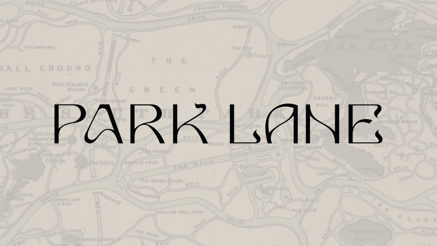
Mother Design has created an Art Nouveau-infused identity for luxury hotel Park Lane, which sits across from Central Park in New York City. The design was in fact inspired by the contrast of the park’s flora and fauna as well as its wandering paths set against the rigid grid of the city.
From Mother Design’s website: “The new wordmark is inspired by both the architecture of the building and the nature within the park. Meandering lines, like wandering paths, taper off into whimsical, ornate flairs that resemble botanical tendrils. These organic elements are contrasted with contemporary, straight lines that harken back to the hotel’s iconic facade. Similarly, the “cartouche” shape of Park Lane’s windows informs the brand’s shape language; it serves to frame imagery, patterns, and text across the digital and physical spaces.”