
Cyclist Lance Armstrong was a hero—until he wasn’t. His crash also almost took down the cancer foundation that he founded—Livestrong—especially when Nike pulled sponsorships and almost no one wanted to be seen wearing any of the foundation’s millions of ubiquitous yellow wristbands—or should we say, wristbrands.
![]()
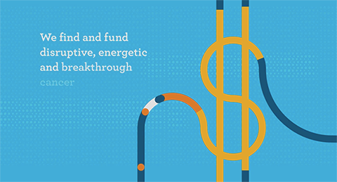
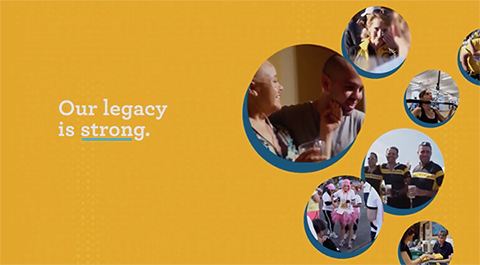
The charity has now relaunched with a new identity and approach that does not even mention its founder. The band-shaped logo has been shelved, but a circular theme is still in place. Three rings—orange, yellow and blue, representing legacy, collaboration, and solutions—on a blue background presents a fresh, energetic face. Circles are used as photo containers, background patterns, graphics, and animated objects. The stress is now on the many, not the one.

Check out the organization’s rebrand video at