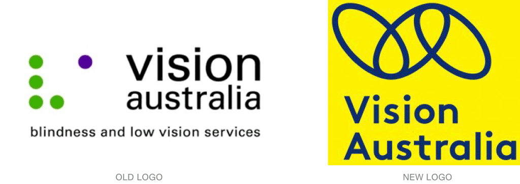
Working with Designworks, Vision Australia has developed a new brand for a client who represents a unique group: people who are blind or who have low vision.
The new logo is built on the concept of linking: Vision Australia serves as a link between clients, donors, fundraisers, and volunteers. The center link represents clients. The other two links represent funding, volunteers, paid workforce, community partners, and advocacy.
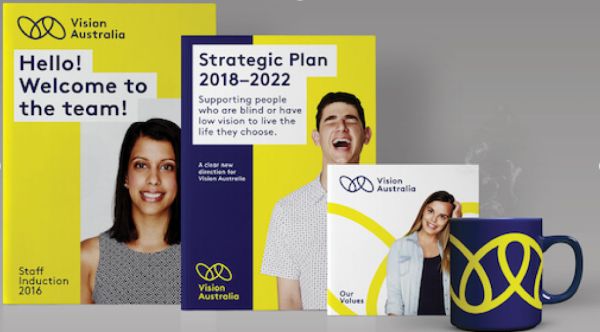
Other key parts of the design are large, simple fonts and high-contrast colors, both of which make the brand more visible to Vision Australia’s clients.
“That normally presents challenges. As soon as you tell a designer to put everything in large print, they start groaning, but I think the designers have risen to the challenge. We want it to look as good for people who are sighted as those that have low vision,” says James Sterling, creative director at Designworks.
Read more behind the rebrand here.