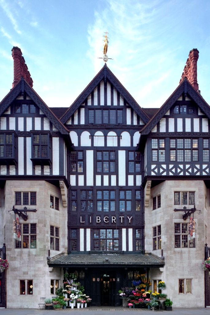
London landmark retailer Liberty, whose flagship store is literally built from the timbers of two ancient battleships, has used its quarantine time efficiently: it worked with Pentagram to update, refine, and expand its brand.

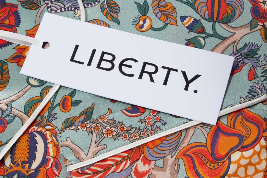
A bespoke typeface, based on letterforms that appear on the sign that has hung over the store’s Great Marborough Street entrance since 1925, is at the core of the plan. The redesigned workmark is modern, but definitely tied to the brand’s heritage. Adding a period to the end of the name also transforms it into a statement, a declaration of action. The store’s familiar purple brand color has been kept, although its gold accent color has been subdued.
With plans to expand into the U.S., the store’s management hopes that the modern yet historic approach will lure in new customers who desire a more upscale shopping experience.