Working with Jones Knowles Ritchie, Kashi has cleaned up its visual identity and logo.
The new design brings the food front and center, displaying it on a clean white canvas on packaging. In ads and packaging, the design will be simpler, with brighter colors and simpler typography. The white-box packaging is now even more unadorned.
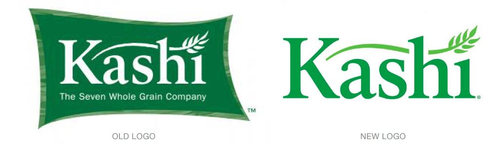
The logo has also be simplified and taken out its green, flag-like bounding box. The old tagline, “The Seven Whole Grain Company,” has been removed.
On the back of the packaging, the company gladly caters to all those cereal-eaters who like to read the box while they breakfast. Editorial-style stories about the food and how and where it was made share the brand story on every box.
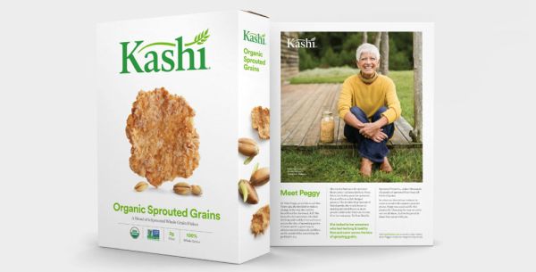
“Kashi is changing the way it showcases its quality, starting with the consumer’s first impression of the product on the shelves and the food itself,” said Tosh Hall, creative director of Jones Knowles Ritchie. “Our new design reflects values of the Kashi company. The visual identity system and packaging tell the story of the product’s quality, its origins, and the dedicated people behind the Kashi brand.”
To see more of the new design displayed on all Kashi packaging, simply click here.