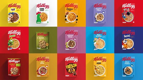
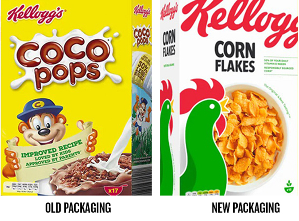
- Landor has coordinated the chaotic brand message that Kellogg's cereals previously conveyed in the European market.
Because it offers so many cereal varieties, and because each variety has its own name and graphics, the very recognizable red Kellogg's brand script had been greatly deemphasized. By making the script larger, and by allowing it to bleed off of the front—forcing the buyer's brain to engage a bit longer in order to read it—the focus is put back on the brand.
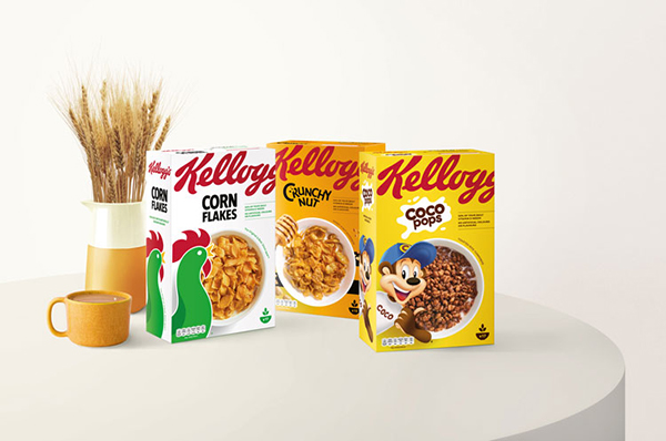
Another important part of the new design is a cereal bowl full of product, viewed from above. This circle shape catches the eye, as do the bold colors used on each box.
https://www.designweek.co.uk/issues/25-february-3-march-2019/contemporary-redesign-for-kelloggs-looks-to-make-it-instantly-recognisable/
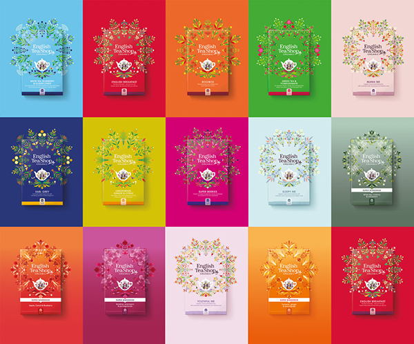
- A flavor “mandala” is at the center of new packaging created for English Tea Shop by design firm Echo. English Tea Shop is a tea company based in Sri Lanka that aims to disrupt mass-market premium organic tea offerings.

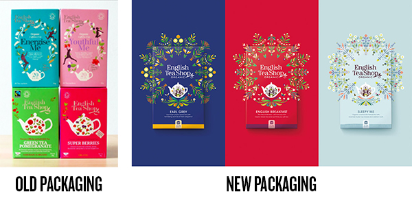
Each mandala highlights the ingredients of its respective variety. Bold background colors borrowed from the Sri Lankan culture. At the center of each package is a redesigned English Tea Shop brand mark, a crest of sorts housed, appropriately, in a teapot.
https://www.echobranddesign.co.uk/thinktank/2019/2/15/echo-revitalises-english-tea-shop