Seventeen years ago, in its salad days, the dating site eharmony began as an unassuming, all-lowercase entity. But like many online monikers of the time, it eventually felt the need to stress its “e-ness” (and likely stress benefit) and so capitalized its H. Now, the company has circled back to its origins and is just plain eharmony again.
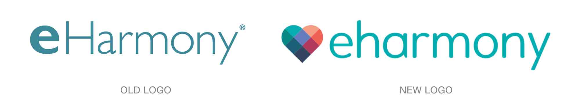
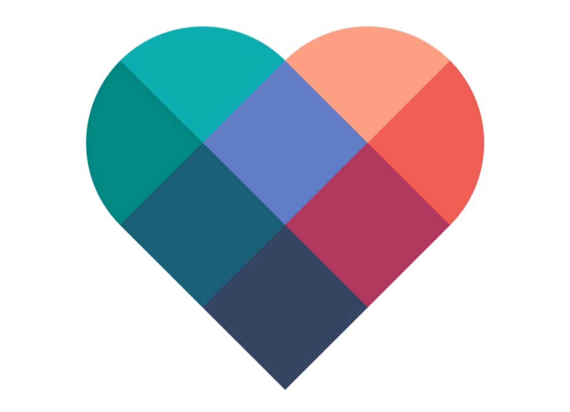
From Shaily Savla, senior manager of creative services for eharmony, on the design of the new logo: “Staying true to its core, the brand name is written in a font that is warm. A dynamic heart shines above it, illustrating the insights, expertise, and experience we bring to creating compatible relationships. Together, they combine to represent the value we help createlove and science work better together.”
For a full history of the company’s logo, see https://www.eharmony.com/dating-advice/dating-advice-for-you/meet-the-new-eharmony-logo/#.WbhhL9OGOu6.