Kickstarter’s rebrand is generating mixed reviews from designers, largely given that most felt the original was just fine, thank you.
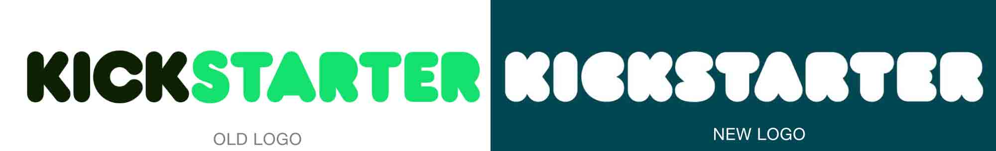
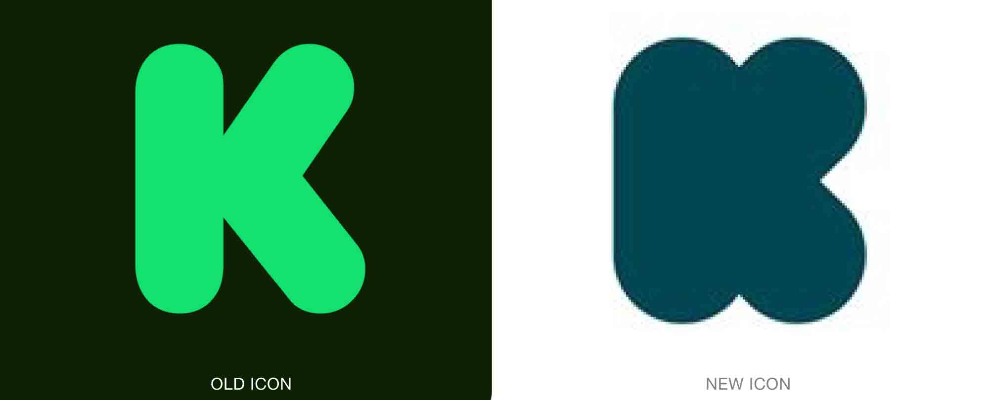
Created by the design firm Order (itself a Kickstarter success), the new design could easily be described as puffy—and it’s not exactly clear why inflation seemed appropriate. It does capitalize on the nature of the original logo, pushing the bubble-letter theme forward. But legibility has been so greatly diminished, and without the benefit of two colors, there’s no longer an identifiable shape or set of shapes for the brain to file away. In smaller sizes, it’s not readable at all, as a word or memorable shape.
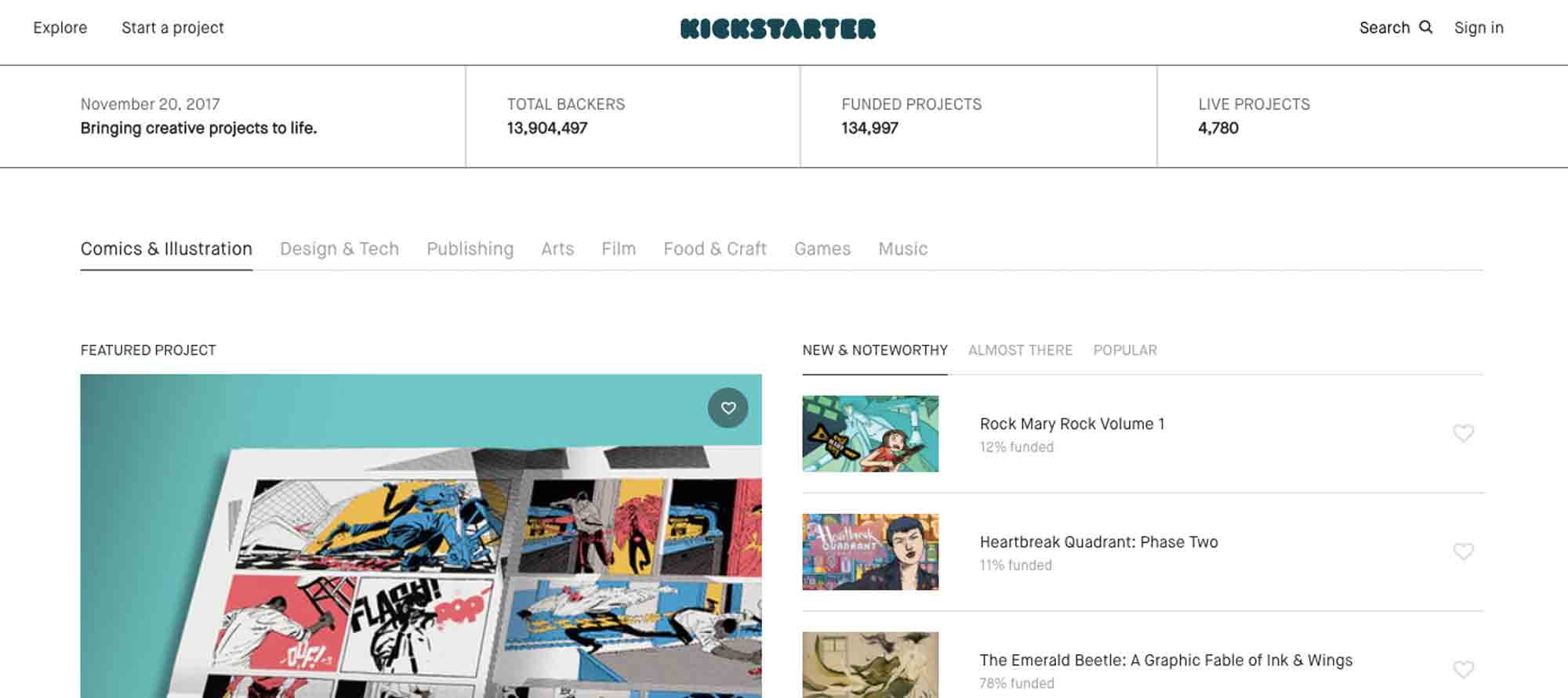
On the company’s website, where you might be most likely to see the wordmark, it is writ small—appropriate in that the Kickstarter identity probably should not outshine the projects it is promoting. And the new website is indeed very clean and easy to navigate. So it may be that this new dimmed-down identity will make good business sense.
Read more here.