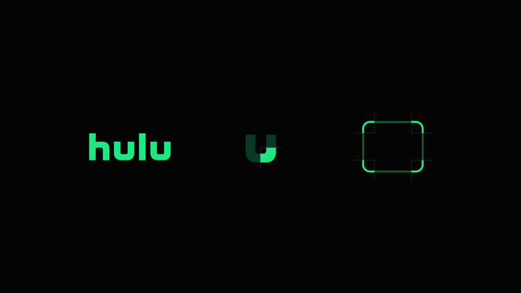
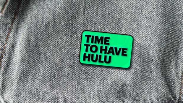
Central to the plan is what the design team calls “the vessel,” a rectangular, round-cornered graphic styled after the rounded nature of the Hulu wordmark and that of its letterforms. The vessel can be woven into photos as an internal frame, used as an in-app button shape, employed as a lock-up with the wordmark, and in many other ways: its generic shape enables it to be used in a very forthright as well as very subtle ways.
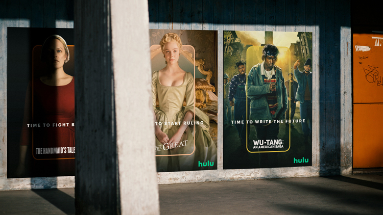
“It is threaded through every aspect of the experience and creates a powerful visual signature,” says design director Astrid D’Hondt. “Its simplicity is its strength—it becomes a guide through the product, a messaging system in social and marketing, and a way to spotlight Hulu Original content.”

https://www.designweek.co.uk/issues/5-11-april-2021/dixonbaxi-hulu-rebrand/