The Huffington Post is now simply HuffPost in all references, and it has a new identity to go with its officially pared-down name.
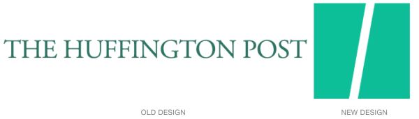
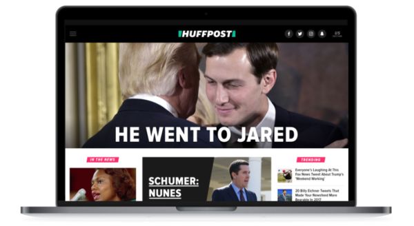
The centerpiece of the new look is the organization’s “splash”: a split green square that acts as the letter H, a logo, container, icon, parenthesis, banner, layout graphic, and more. It’s a simple but versatile device that organizes yet stays out of the way of information. The splash’s center slash subtly refers to a URL slash, but it has lots of possible meanings. From a HuffPost release:
“We landed on this final version because we love what happens when the two shapes join together as the new icon for our apps and social channels. The mark itself forms a road, a slash, an abstract H?everyone sees something different, and we embrace all the possibilities. We’ve also updated our signature green, the color audiences associate with HuffPost, and brightened it for this new era. ”
The identity’s new typeface, National, is much bolder and more modern than the Post's previous newspaper-like nameplate. HuffPost designers partnered with the firm Work-Order for the redesign.
Read more behind the new logo and look here.