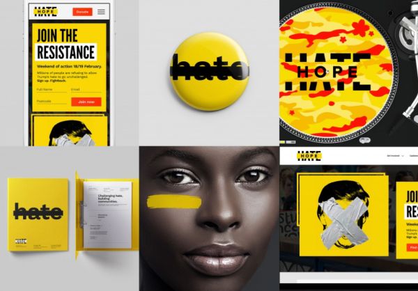
The anti-racism charity Hope Not Hate needed a serious new identity, something that showed it was a strong contender in today’s political fight arena. Blue Slate Digital created a forceful new approach that is extremely easy to understand because it uses a common graphic conventiona bar or “strike out”to block out “hate” words and images.
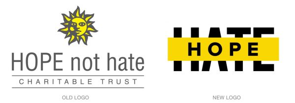
The designers chose sunshine yellow as the base for the new identity, a color that feels hopeful and which was present in the charity’s original identity.
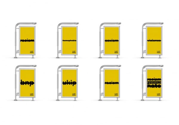
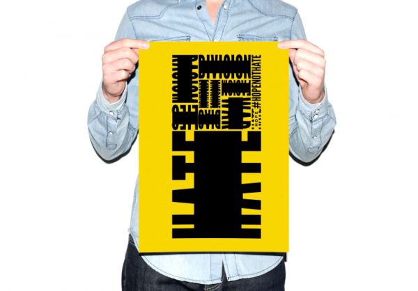
The strike-out covering the word “hate” in the core logo is called a “bar of hope. ” That bar is very adaptable: it can be used as a text box, photo addition, art element, or template component. Flexibility was crucial for the grassroots charity, whose members will all have changing and specific needs, depending on the circumstances in their locales.
“We wanted to build a brand that feels that you could own it,” says creative director Chomois Picho-Owiny. “You can use the hashtag, you can recreate the logo, you can modify it for your own needs. ”
See more of the new look, by visiting Hope Not Hate’s website here.