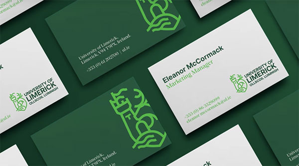
Like many universities, The University of Limerick had a heraldic logo that did not distinguish it from any other university. Change the printed name of the school, and the old design would suffice for many institutions. Its contents—representations of the Tau Cross, a familiar local symbol, the Irish elk, a creature related to the local province of Munster, and St. John’s Castle, which represents the city of Limerick—were meaningful, but they did not fully represent the university as a modern entity.
![]()
The school’s new logo is a mesh of old and new. The cross, elk, and castle are still included, but modern landmarks have been added: the university’s soaring flagpoles and the Shannon River. More than 2,000 school staff members, students, and alumni contributed to the redesign process. Their contributions tied in unique and more recent histories, such as unusual letterforms from a particularly historic campus event.
From an article in the Limerick Post: “One of the fonts used in the new logo took its inspiration from the ‘Limerick demands a university’ sign widely used during student-led marches in 1969. The original motto, Eagna chun Gnímh, translated as Wisdom for Action, still rings true and will be elevated as a central theme in the new brand message.”