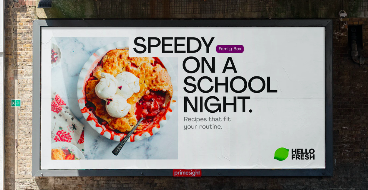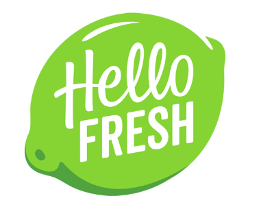
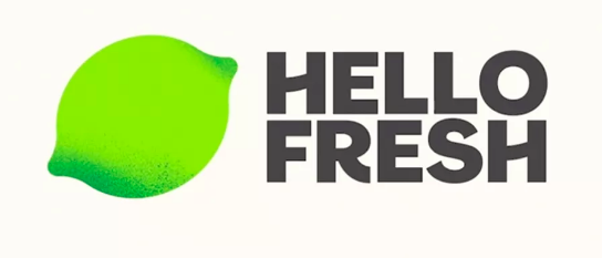
Meal kit service HelloFresh has a new identity, created by DesignStudio. Although the familiar lime has been retained from the original design, the app icon is very different: it has a grungy, speckled color scheme that some have called “dirty” or even “moldy,” attributes that definitely should not be associated with food.
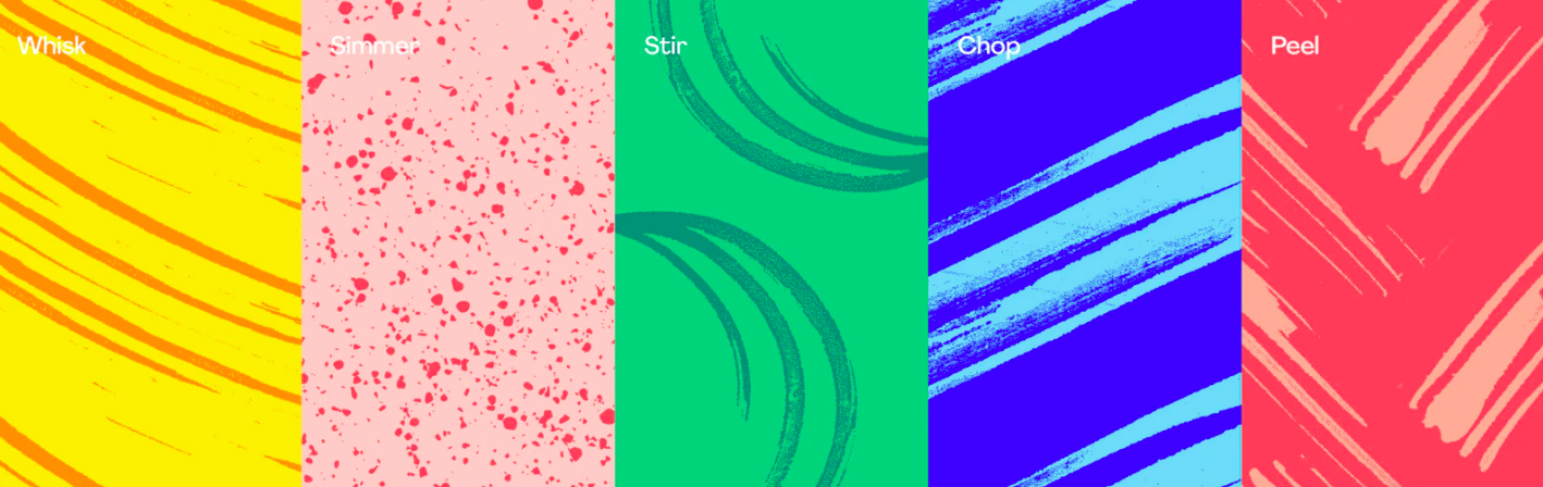
But the rest of the rebrand definitely speaks of freshness and easily achievable success. Bright colors and plenty of white space help create the feeling that cooking a HelloFresh meal might be the simplest, most enjoyable moment of the day. The patterning that doesn’t work as well on the app icon is successful in other applications such as patterning and illustrations. Eating utensils such as forks and knives were used to create patterns called Whisk, Chop, Peel, to name a few.
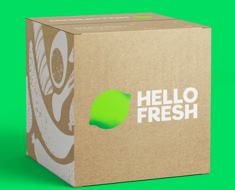
At the center of it all is the HelloFresh lime. From the DesignStudio website: “Our new lime logo still has all the recognizable qualities of its predecessor (shape, size, color, angle) but has been simplified to work anywhere—big or small, online or in print, static or rolling across the screen.”