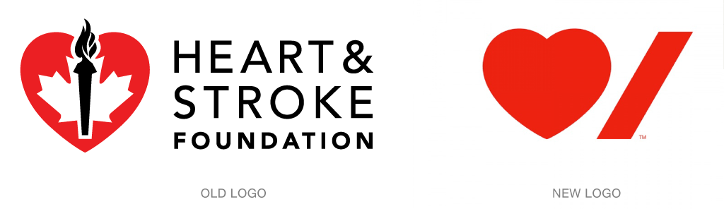
Pentagram’s Paula Scherr has created a new and impactful identity for the Heart & Stroke Foundation of Canada that speaks clearly of the organization’s central concern and mission.
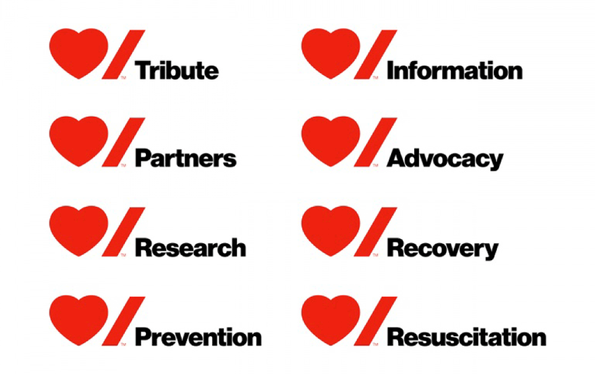
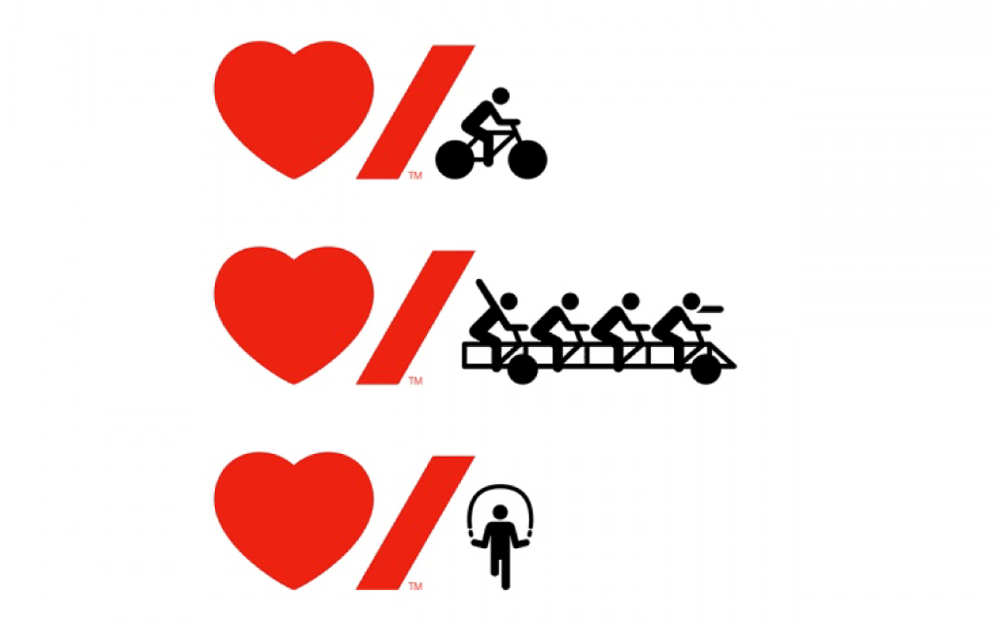
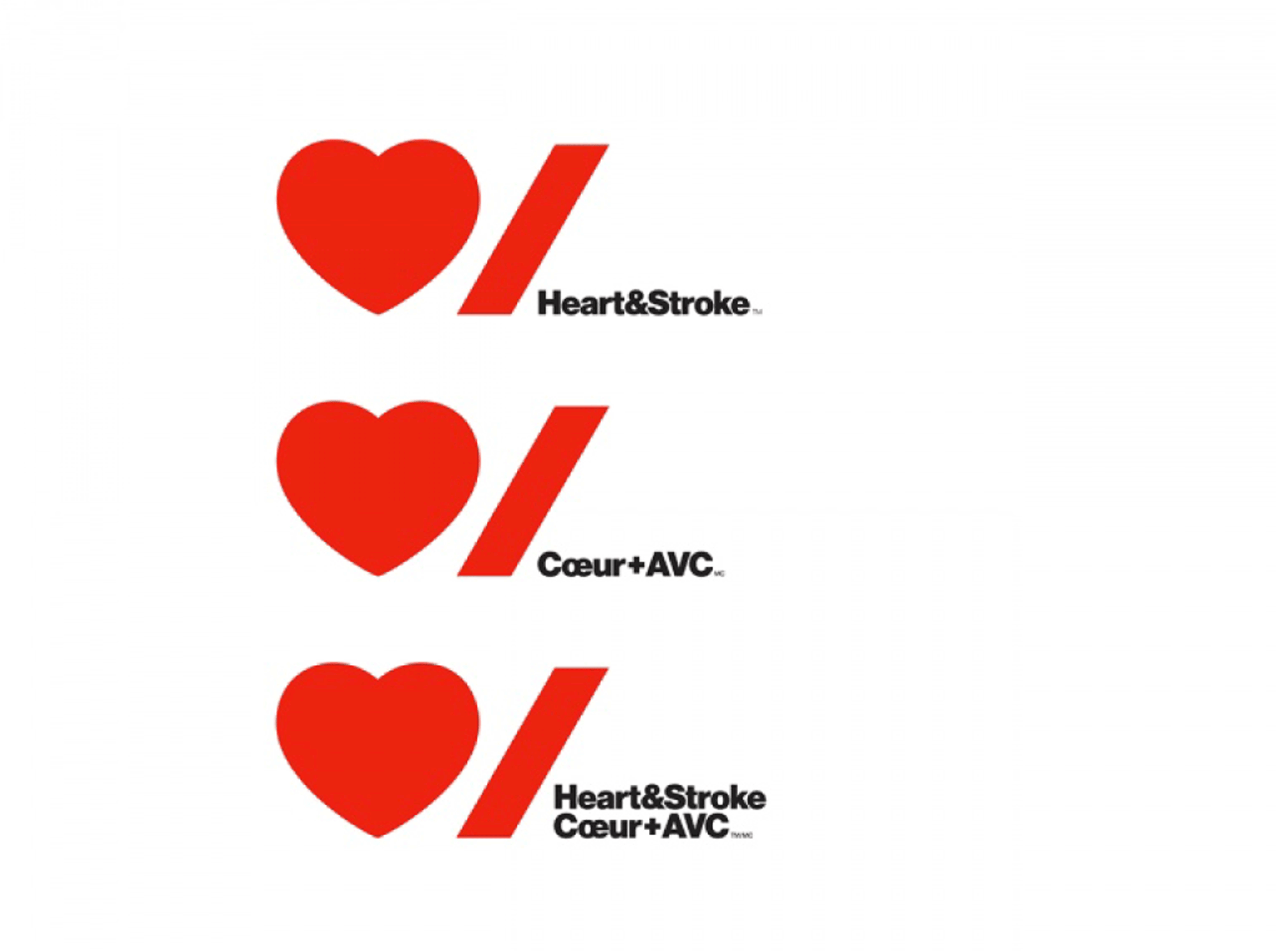
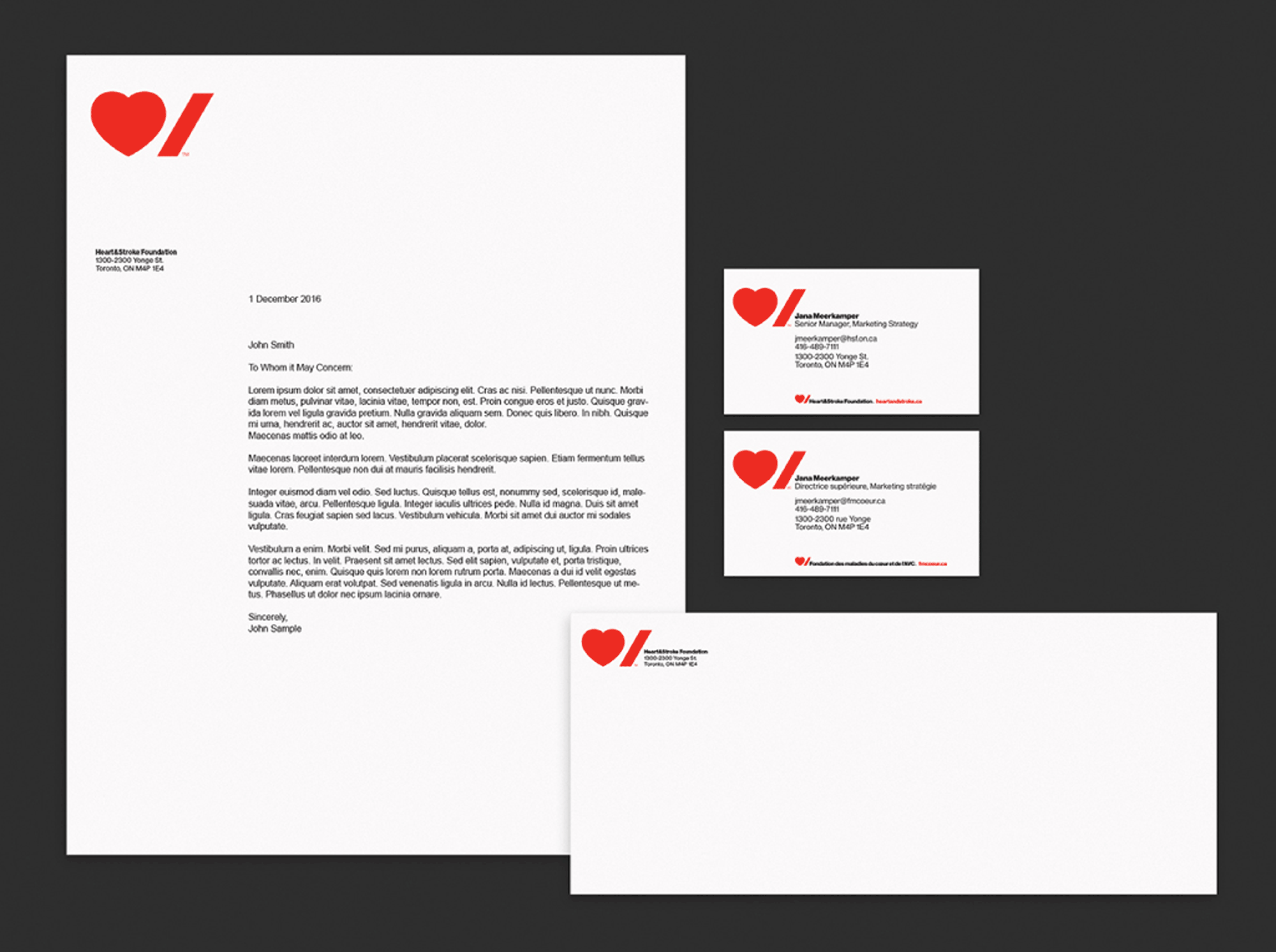
From a Pentagram release: “The identity centers on a bold, modern logo that uses the simple icons of international symbols to create a friendly, accessible and democratic visual personality. The logo pairs the graphic icons of a heart and a stroke, which also reflects the new focus on the organization’s more commonly used name, Heart & Stroke. One of the challenges of the identity was fulfilling the official bilingualism requirements of the country. The symbols transcend language, and while the stroke symbol does not translate as directly to the French word for stroke as per English, it represents a feeling anyone who has been impacted by a heart attack or stroke has feltan abrupt punctuation, exactly how stroke interrupts life suddenly. The new system also easily accommodates both English and French by stacking the words in a lockup with the logo.”
The redesign is the foundation’s first in over 60 years and signals a new direction for the group, a more modern, relevant approach meant to engage not only those directly affected by heart attacks and strokesmost commonly, older individualsbut younger investors and volunteers as well.
Read more about the new identity here.