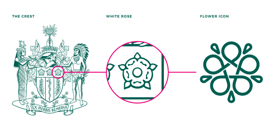
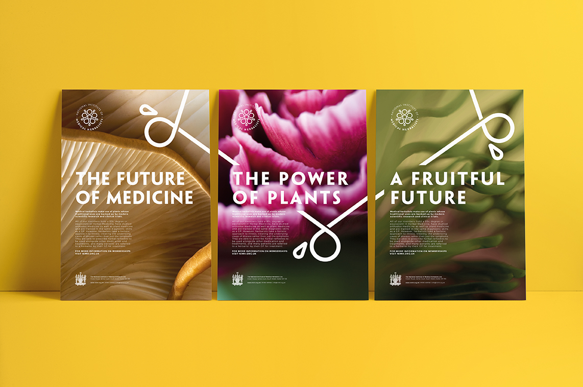
Exeter-based Buddy Creative has created a new brand identity for the National Institute of Medical Herbalists, the UK’s largest and oldest regulator of herbal practitioners. Founded in 1864, of course the group had an elaborate crest. Buddy designers extracted and abstracted a white rose motif from the crest, creating a new flower-like design that can be used whole as an icon and logo or broken into pieces to form art elements.
![]()
https://www.buddycreative.com/project/national-institute-of-medical-herbalists/
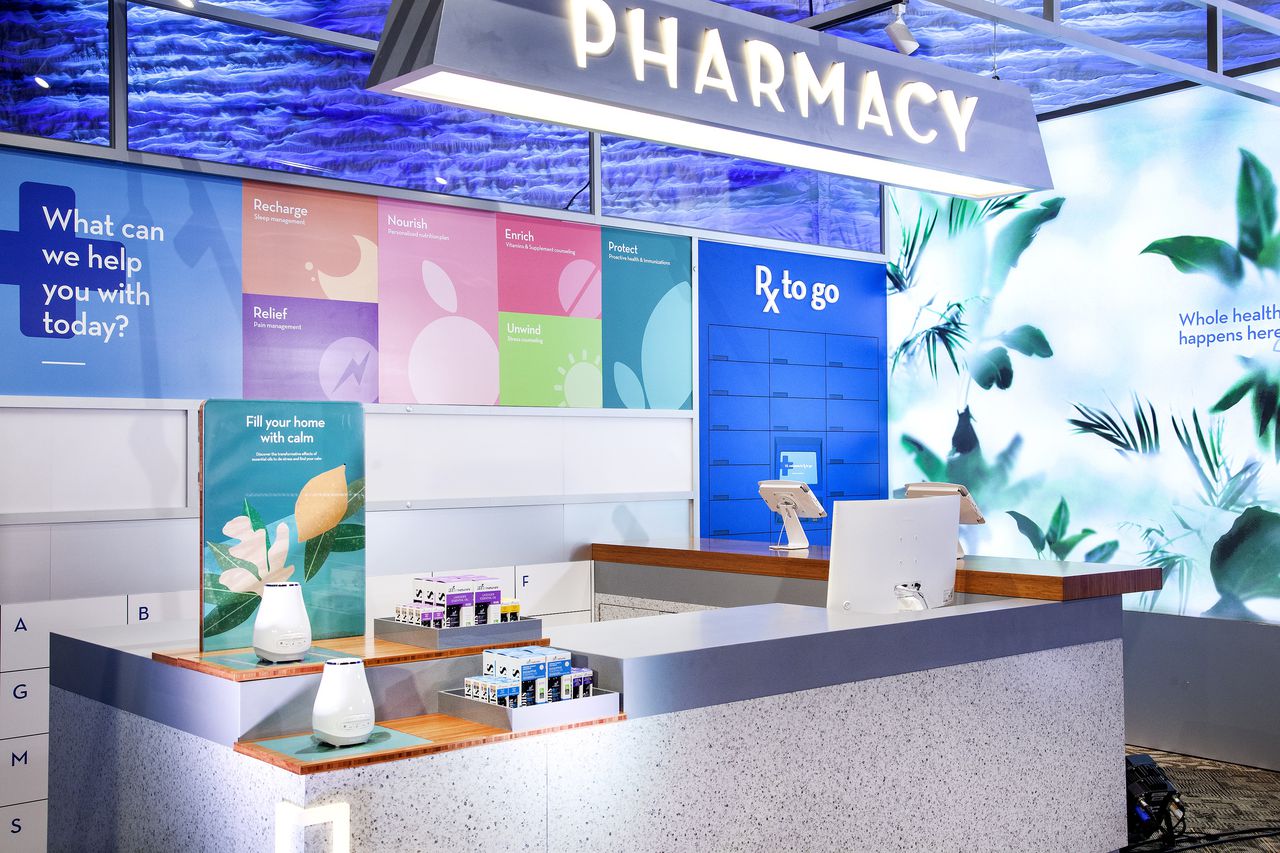
Drug store chain Rite Aid has created a new brand identity that feels decidedly warmer than its previous red and blue design. The new identity preserves the shield from its previous design and uses predictable “health” colors—blue and green. Its typography is a little dated, but the whole plays out well on proposed website and in-store updates.
https://www.riteaid.com/rxevolution