Girlguiding, the national guiding/Scouting organization for girls and young women in the UK, started a lengthy rebranding process in 2018. In 2021, Landor & Fitch was retained to create a new visual identity for Girlguides that will make the organization more relevant to families today and tomorrow.
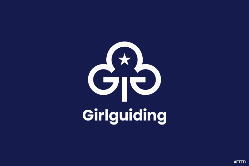
Landor & Fitch began with the Guides’ familiar trefoil logo. The new, bolder design contains two embedded G’s that support the upper globe. Inside that globe is the star from the original logo, which represents the individual, inspiration, achievement, and recognition. A bright white-led palette creates a much more muscular presentation.
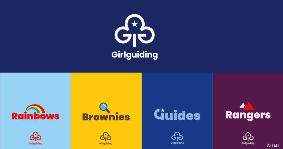
The sub-brands for the four age divisions—Rainbows, Brownies, Guides, and Rangers—have largely been retained but modernized. In addition, a wide range of icons has been developed for each division, and more icons will be developed over time.
The new brand is now in use on the Girlguides’ website, in the organization’s communications, and in the online shop. Program materials will be brought up to speed in 2024, while uniforming won’t change until 2026.
https://www.designweek.co.uk/issues/6-march-10-march-2023/girlguiding-rebrand-landor-and-fitch/