The southern hemisphere’s largest seafood market, the Sydney Fish Market, has teamed with Interbrand to create a rebrand that is built directly from unique elements in the client’s heritage.
The new mark was inspired by the market’s distinctive wave-shaped roof, which itself was inspired by the waves of the ocean. New to the identity will be rich photography that shares the vibrancy of the market’s everyday life and harvests.
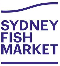
The brand color, a bright blue, came from the Fish Market’s distinctive blue crates, which are used throughout the world.
“You can walk into a fish shop in Melbourne and the first thing you'll see is a Sydney Fish Market crate. That tells the story of the evolution of the brand,” explains Lauren Drummond, CMO of Sydney Fish Market, in a recent CMO article.
The redesign was pushed forward by the ongoing redevelopment of the port area where the market is located. The neighborhood is destined to become a major dining, market, and tourism draw. The Fish Market’s updated identity will serve as a equal match to the area’s new personality.