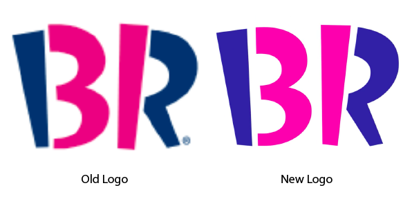
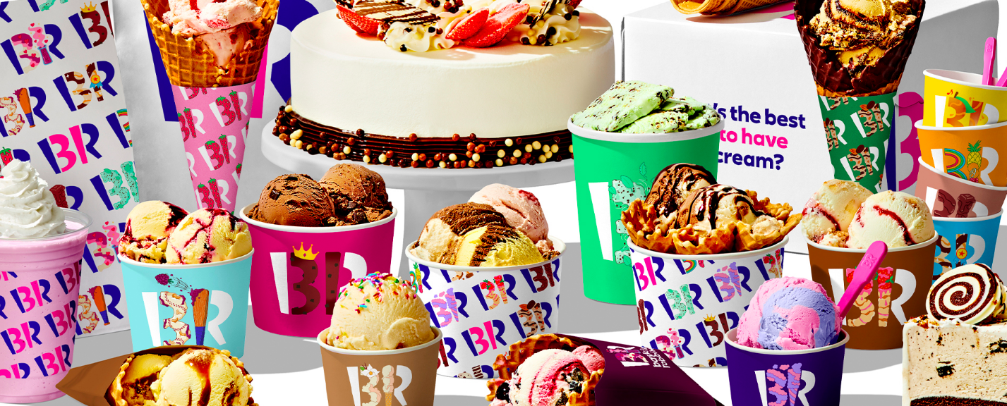
Jones Knowles Ritchie recently updated Baskin-Robbins’ familiar 31 logo to reignite the original concept behind Burt Baskin and Irv Robbins’ very first store: variety. Customers should have enough flavors to enjoy a different ice cream every day of the month.
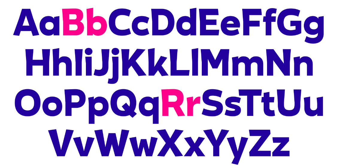
As the ice cream giant has grown under ownership of Inspire Brands—it has more than 2,500 stores in the US and approximately 5,000 more in the 50 countries it serves worldwide—the delightful significance of the 31 in the logo has largely been lost. JKR’s goal was to bring the focus back to variety. It began with a bespoke font based on the distinct personality of the 31 symbol. That font now populates the entire identity system.
It also removed the gray from the pink and blue brand colors, rendering them brighter and cleaner. They also added a bit more space between the numerals at the center of the logo and their adjoining letter elements. This slight shift, combined with the brighter colors, causes the 31 to pop.
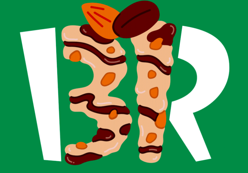
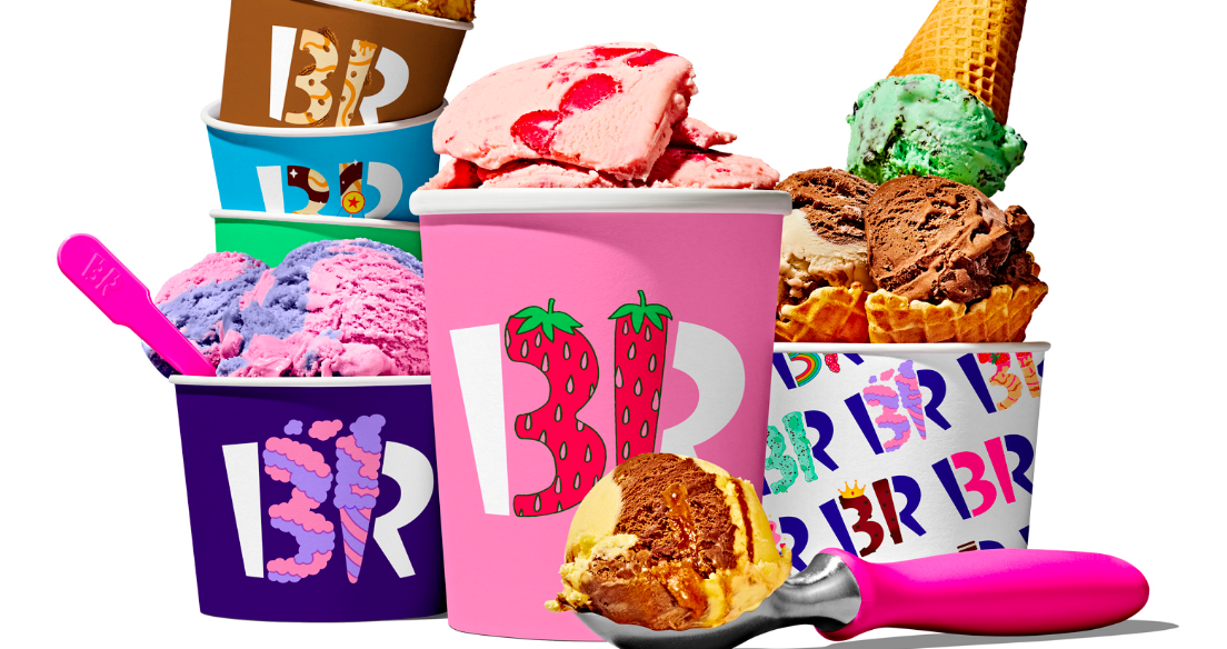
Color, flavor, and delicious excess also reinforce the brand’s variety. The most popular ice cream flavors were each given their own mini-identity that is literally built from flavor attributes and recipe contents. The identity for mint chocolate chip, for instance, is pale green, flecked with chocolate bits, and surrounded by illustrated mint leaves.
The corporate logo is still used in the now-refreshed pink and blue.