
• Faced with the challenge of building a new “seafood love brand,” design studio Fitzroy created Mamasea. Its client, a Norwegian family in its third generation of salmon farming, embraces technology in its work but also has a true respect for nature.
The designers created an identity inspired by Japanese art: a repeating S-shaped wave that contains the serene face of Mamasea, a Mother Nature-like icon who cares over the seas and its creatures. The new brand’s color palette of black, sand, and coral—the color of salmon meat—is clean and modern. The coral accent color also pops well off of moody photography of the sea and surrounding environment.
https://www.creativeboom.com/inspiration/from-the-sea-for-the-future-a-new-identity-by-fitzroy/
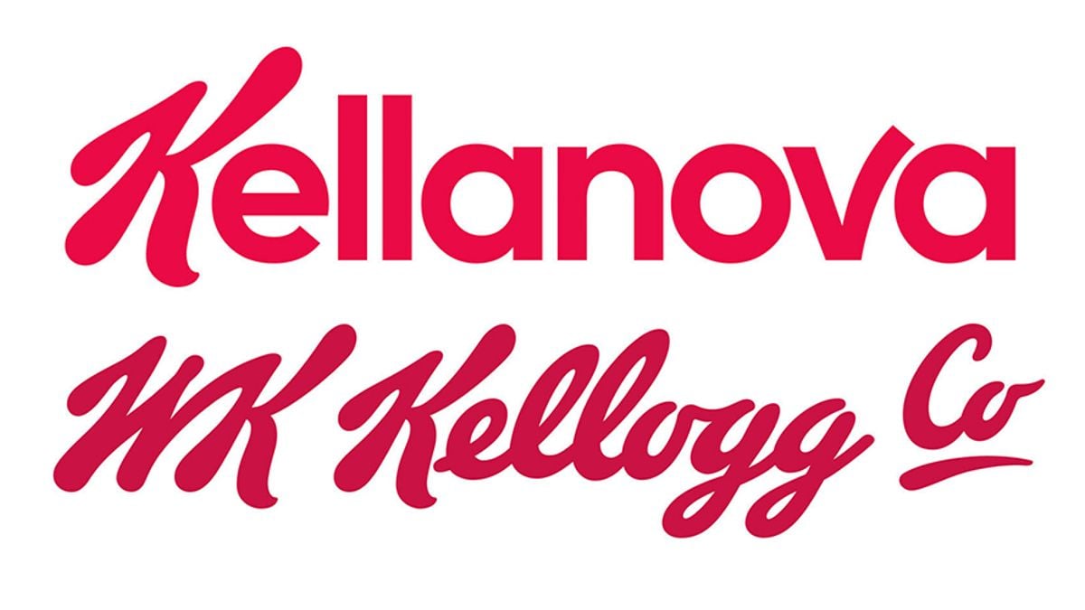
• By the end of 2023, cereal giant Kellogg’s will split off its snack food business—responsible for about 80 percent of its total sales—as Kellanova. The cereal division will now be called WK Kellogg Co. The iconic initial K and red brand color will tie the two divisions together.
From a company statement: “The ‘Kell’ overtly recognizes our enduring connection to Kellogg Company, while ‘anova,’ which combines 'a' and the Latin word ‘nova,’ meaning ‘new,’ signals our ambition to continuously evolve as an innovative, next generation, global snacking powerhouse. The Kellanova logo retains the iconic Kellogg Company ‘K’ to intentionally connect to our heritage and the strong foundation that got us to where we are today. The forward curved and extended ‘v’ embodies our forward momentum as we embark on this next chapter.”
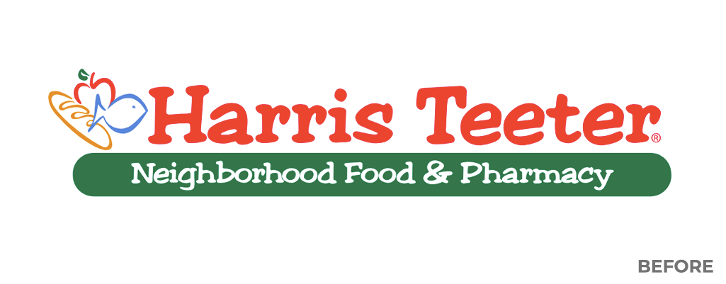
• Harris Teeter, the 60+-year-old grocery brand owned by The Kroger Co., has a refreshed identity, created with the help of marketing agency Luquire. Based on the new strapline, “In food with love,” the new plan replaces a quirky serifed wordmark with a sans serif design that is distinctly more modern and corporate. The outlined food icons on the left side of the design are now solid forms.
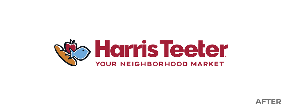
According to the design’s developers, the goal was to reflect a more upscale shopping experience. The new design will be rolled out over the company’s 250 stores “soon.”
https://www.charlotteobserver.com/news/business/whats-in-store/article273073965.html