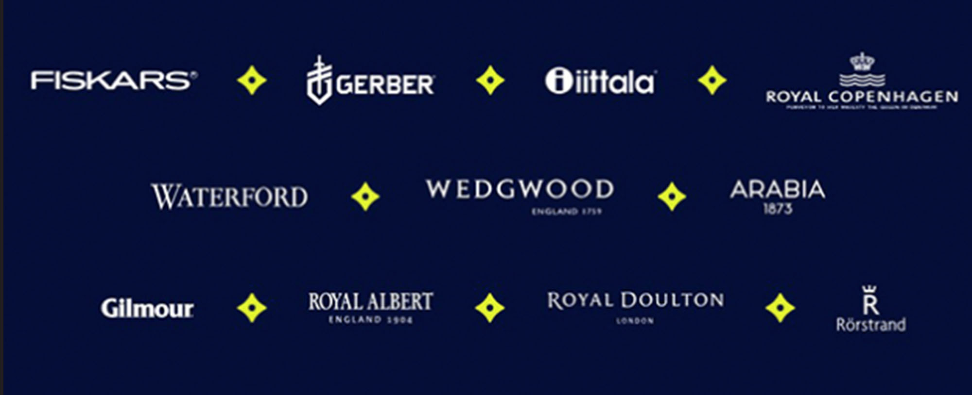
Many consumers think “scissors” when they hear the name “Fiskars.” In truth, The Fiskars Group is the umbrella name for many other well-known corporations owned by the company: Waterford, Wedgwood, Royal Albert, Royal Daulton, Gerber, Royal Copenhagen, Fiskar’s consumer group (think “scissors”), and more. The company was founded in 1649 as an ironworks company that created tools for farmers and which grew over the centuries by acquiring other household brands.
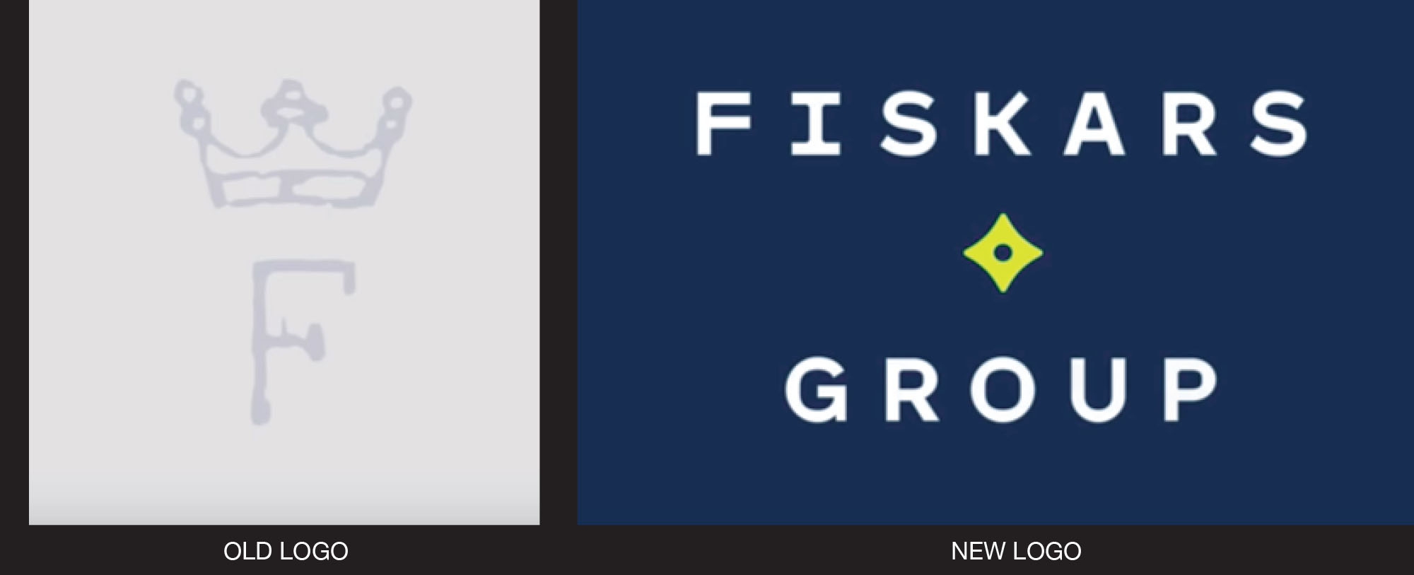
DesignStudio helped The Fiskars Group unify its many properties with a new logo, a star-shaped mark that the identity launch video indicates was built off the shape formed by the points and swales of the crown used in its very first company mark.

From a Fiskars’ press release: “‘Our new identity is inspired by our DNA. The symbol for Everyday Extraordinary is a catalyst for the connections between brands, people and ideas. The graphic language highlights and celebrates the extraordinary moments when people and ideas come together,’ says Alexander Matt, Fiskars Group’s chief marketing officer.
“The new identity for Fiskars Group will also help differentiate from the Fiskars consumer brand. The consumer brand is globally recognized for its iconic orange color and will continue to empower everyday creativity through purposeful design.”

Read and see more, here.