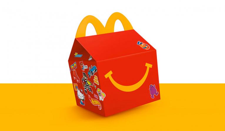
Tyler Brooks, creative director of Turner Duckworth, is interviewed by QSR magazine about the challenges of restaurant branding in a socially distanced world. Turner Duckworth has a long record of branding and rebranding restaurants, including clients McDonald’s, Burger King, Little Caesars, and Tim Hortons.
From the article: “Consumers aren’t afraid to be vocal and their expectations have never been higher. They’ll quickly see through any facades. They need to feel reassured that the brand is looking out for them on a human level.”
Popeyes’ logo has grown up. Jones Knowles Ritchie has created a new, streamlined identity that speaks more of the history and cultural roots of the brand. Even during a pandemic, the Popeye’s organization is moving ahead with expansion, working to boost public confidence in its brand and in feeling comfortable about just venturing out for a meal.
From a Fast Company article on the project: “[The design team] brought on former Bon Appétit photographer Alex Lau to add a higher-end editorial feel to imagery that emphasized color and shape. They brightened the brand’s signature orange based on that photography (and even pulled the color from a photo of the chicken itself, using the Adobe eyedropper tool). Hartford and her team also created new, original illustrations on food packaging to pay homage to New Orleans icons and the Popeyes cooking process, and a new chicken icon called ‘Poppy.’”
https://www.fastcompany.com/90508666/popeyes-ditches-its-goofy-branding-for-a-buttoned-up-new-look