Pentagram has created an identity for The Woodstock Cannabis Company that builds off the emblematic bird-on-guitar image used on posters that advertised the four-day music festival in 1969.

A Pentagram release includes an interesting account of the origin of the original Woodstock design, created by designer Arnold Skolnick. “Skolnick’s rendering of a white dove (symbolic of peace) perched on the neck of an acoustic guitar actually resembled a catbird, a large […] bird found in the upstate New York region. Skolnick cut out the words and the bird image out of paper and tried several different layouts before landing on the final poster design. Skolnick was hired on a Thursday and delivered the poster the following Monday. He was paid $15 for the job. The artist went on to have a successful design and publishing career but his claim to fame remains his humble Woodstock logo.”

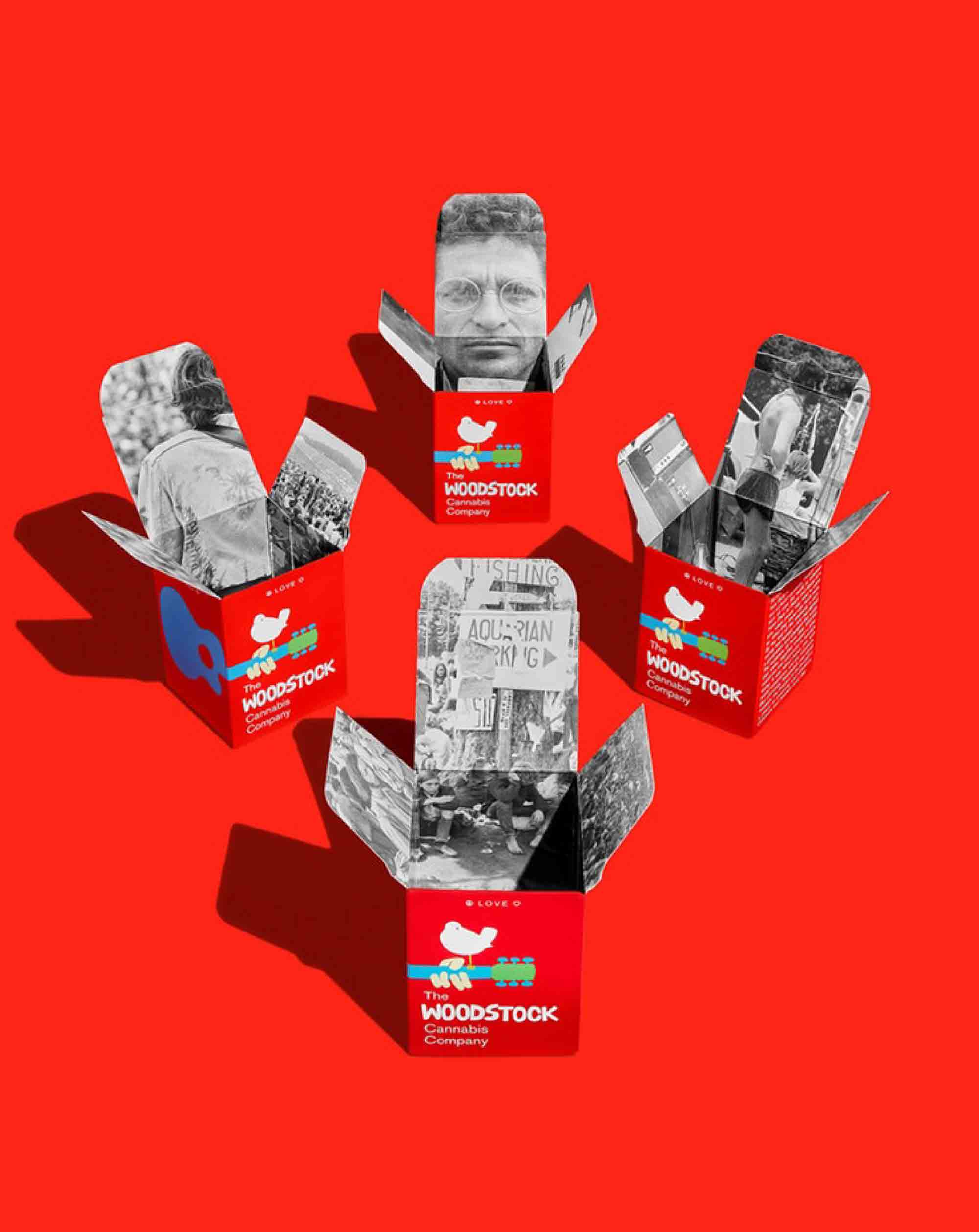
The new Pentagram design also includes surprise reveals in the form of period photos that are found inside the product boxes. Despite the familiarity baby-boomers would have with the photos and the product box graphics, new cannabis users may not have the same knowledge, so Pentagram designers included a brief history of the Woodstock music event as well.
Read more details here.