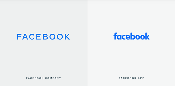
The organism previously known as “facebook” is now FACEBOOK. Following a year-long, in-house rebrand, FACEBOOK will now be used to identify the company that owns facebook (the social media app and desktop site), WhatsApp, Instagram, Messenger, Oculus, and other properties.
A bespoke typeface is of course key to the wordmark’s design. The FB design team notes that it’s tough to imbue personality into an all-caps design, so they added unique notes to the letterforms, such as distinct curves in the A and K. Spacing between characters is generous when regarded individually, especially within “BOOK,” but it holds together as a whole.
The blue-gray, all-caps design will change color depending on the property with which the mark is shown. For instance, on WhatsApp, the word will be bright green; for Instagram, it will be purple. As the company continues to acquire properties, this simple adaptation will be useful.
But the all-caps design—in addition to violating online social graces for SHOUTING—is ultimately a curious choice. Imagine if Google created a new product and decided to name it Google. It’s not as if the new FACEBOOK design—in whatever color—doesn’t offer enough distinction. It offers no distinction whatsoever.
https://facebook.design/companybrand