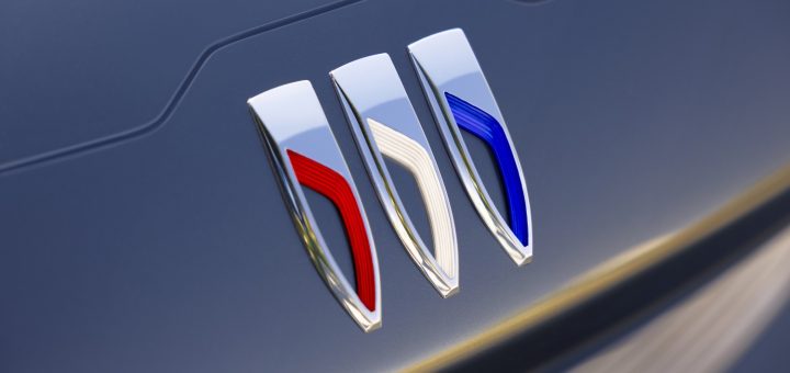
• Like many car manufacturers of late, Buick has unveiled a new logo that better suits its new line of electric vehicles. The shield element has been used by the company since 1937. The latest update places the now-elongated three shields side-by-side, rather than on the diagonal.
Check out the full history of logos used by Buick since 1903 at
https://gmauthority.com/blog/2022/06/evolution-of-the-buick-logo/

• Mother Design has created a new identity for the first-ever all-electric raceboat championship, E1. The typography, color palette, and logo were all inspired by the flora and fauna that lives in a clean marine environment. The font especially has a very fluid feel.
Harry Edmonds, creative director at Mother Design London, says, “E1 is first and foremost an entertainment brand, but one with ambitions to do great things for the planet and leave a legacy of change—the shift away from petrol powered engines on our waterways.