
• The Rhode Island School of Design has a new, more unified brand identity system, created by design firm Gretel. The most noticeable aspect of the new system is a “complete and incomplete” display face (RISD Serif) that was inspired by process of design work: work is always in flux, in process. The new face and a family of other custom-designed typefaces that complement it were created by RISD alumni Ryan Bugden.
In addition to its symbolic content, this “utilitarian” style of the font was important so as to fit in with the existing architecture in Providence, Rhode Island, the school’s home.

• Baywater is a company that specializes in social education through travel, language learning, and cultural experiences. Recently acquired by language school Eurocentres, the organization needed a new identity that visually reflected its growth as well as the excitement of the international experience to potential students from all over the world.
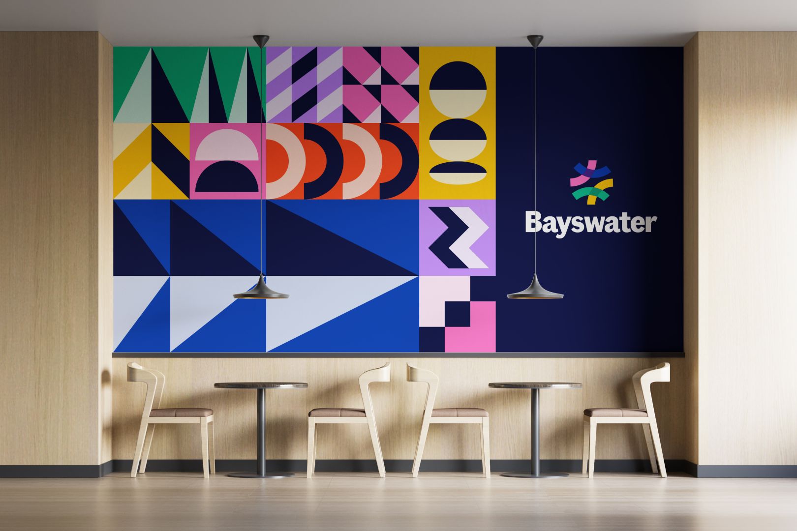
Fiasco Design built on Baywater’s existing icon, a shape built from colorful paths that represent the pathways of students, coming from and going toward different destinations, but all uniting at Baywater. Fiasco created a wide range of exuberant, colorful patterns that express energy and excitement. These patterns, combined with optimistic photos and a flexible grid system, creates a bold, energetic, and greatly refreshed identity for the organization.
https://www.creativeboom.com/inspiration/fiasco-designs-brand-identity-for-bayswater/