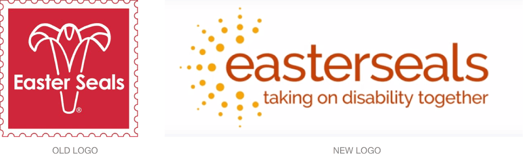
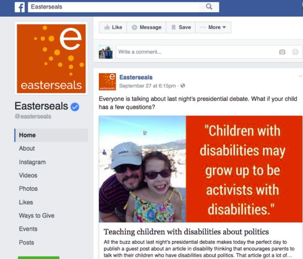
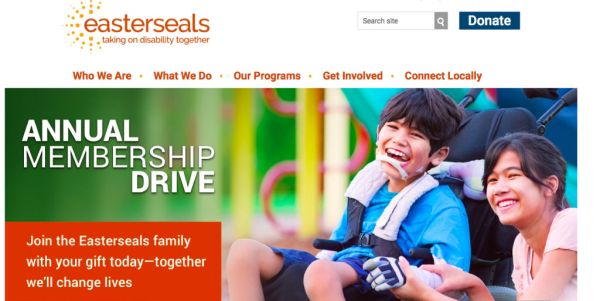
Easterseals has a new brand, created by Siegelvision, which includes a new name (previously Easter Seals), logo, color, and tagline.
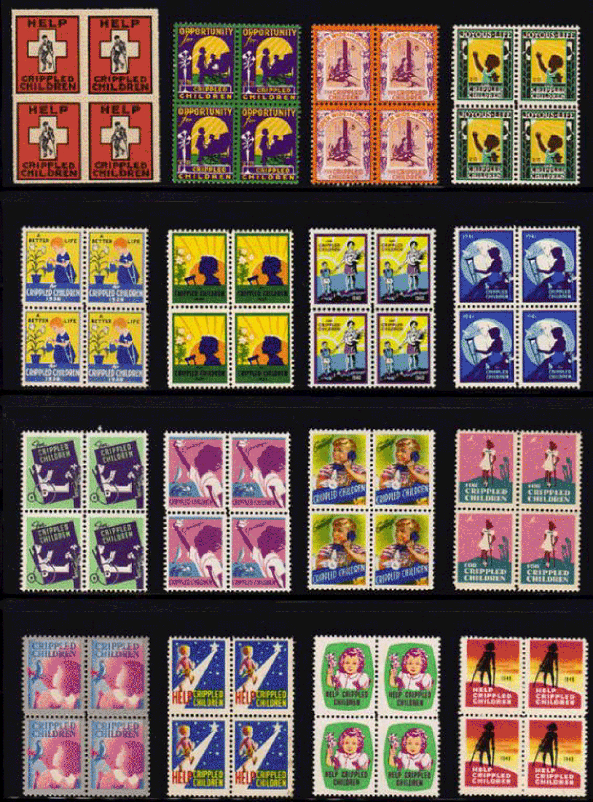
The nearly 100-year-old organization supports more than 55 million Americans with disabilities, but most people don’t know exactly what Easter Seals did or was. The original Easter seal concept was born in 1934, when the National Society for Crippled Children launched an seal campaign to raise funds. Donors received seals or stamps, which they placed on mailed letters to demonstrate their support. The seal showed a lily, a symbol of spring and hope, and the flower remained a part of the seal design for many years. In 1952, the name of the organization was officially changed to Easter Seals, and the lily was incorporated into the group’s logo.
The new single-word name strips away the old association with Easter, seals, flowers, and religion. The lowercase wordmark looks open and accessible. The “e” is used separately as an icon and graphic as well. The warm rays that surround the name or letter speak of light and hope, radiating out into the world.

Read more behind the new identity here. View the Easterseals website here.