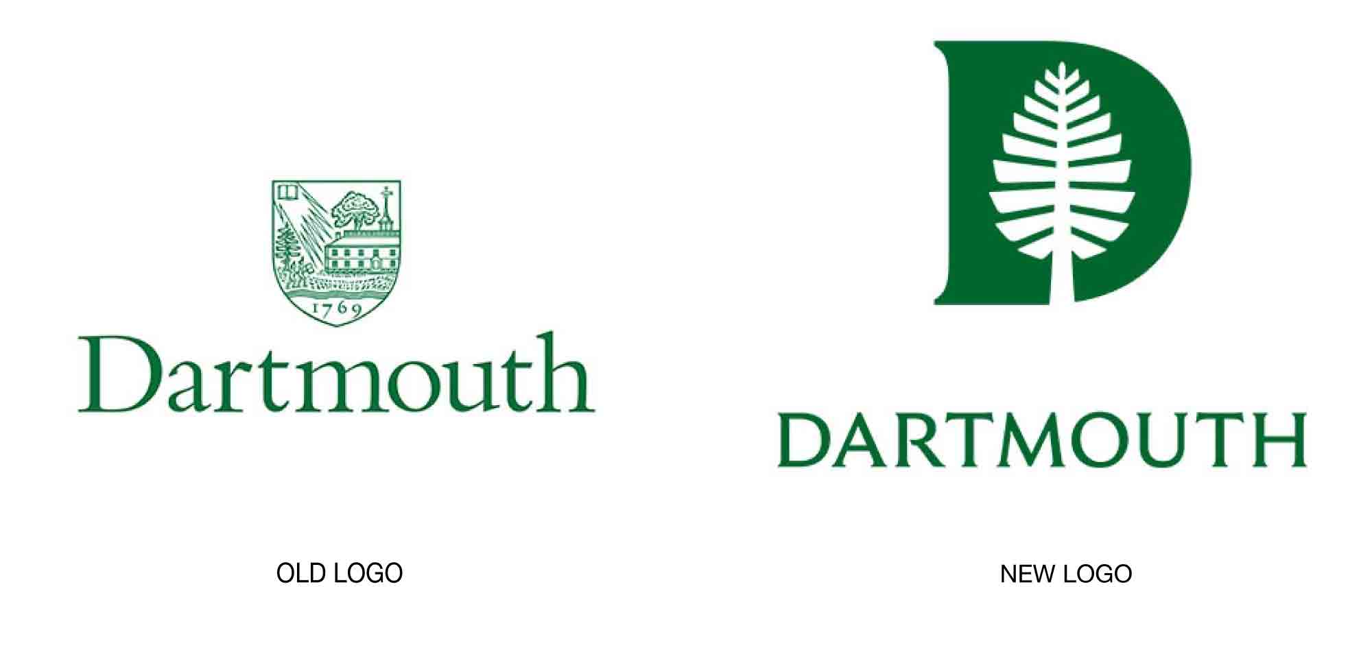

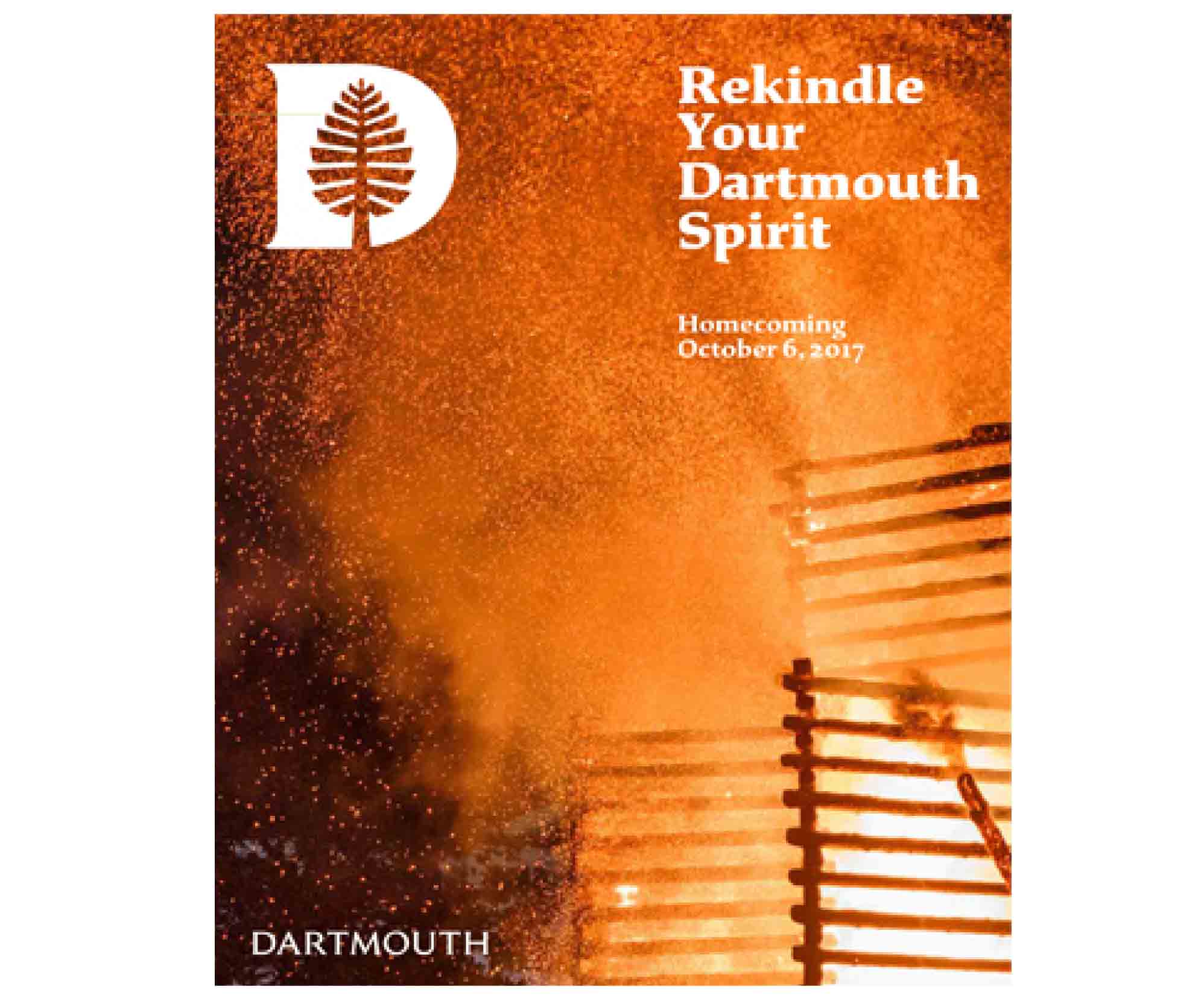
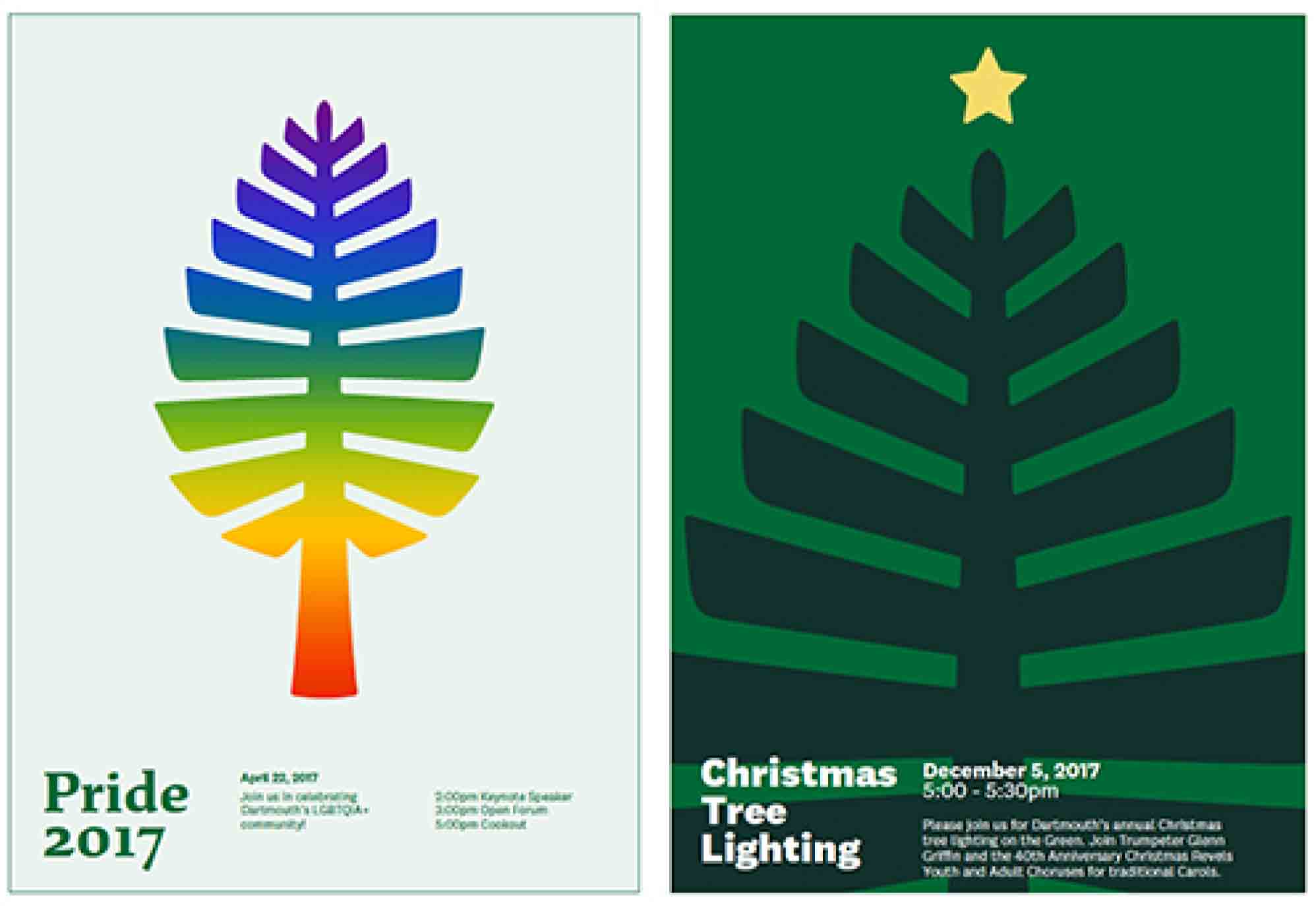
Dartmouth College has a new visual identity that includes a new font, new colors, and updated “lone pine” and a new “D pine” marks. According to the College, the new designs are based on five conceptual pillars: a devotion to the liberal arts; a commitment to the teacher-scholar model of education, in which faculty value both teaching and research; treating Dartmouth as a base camp from which community members venture out to explore the world; a sense of adventure; and a sense of place.
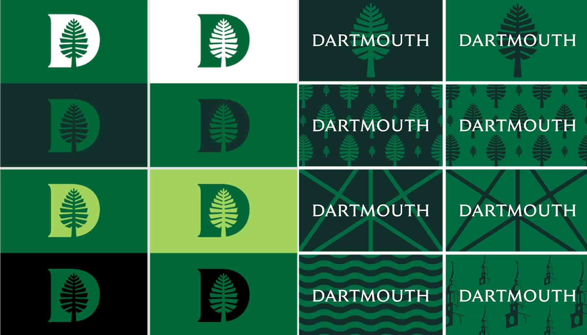
As with many educational institutions, various Dartmouth departments had developed its own internal identity systems, which lead to disjointed messaging. The new designs, created by Original Champions of Design, will unite departments and communications. OCD also developed new brand colors for its client, including the traditional Dartmouth green, “bonfire red,” and “river blue.”
With the logo, the college also released a custom-designed typeface called Dartmouth Ruzicka, based on the typeface used previously on the College’s bicentennial seal and plaque. That typeface was designed by famed type designer and engraver Rudolph Ruzicka.
Find more details here.