The inhouse creative team at Skoda has updated the Czech carmaker’s brand for the first time in 30 years. Like many logos of late, the familiar winged arrow mark has been flattened for better digital and print reproduction. The system will include two shades of green—emerald and electric green—to express both the history of the brand and its future in electric vehicles.
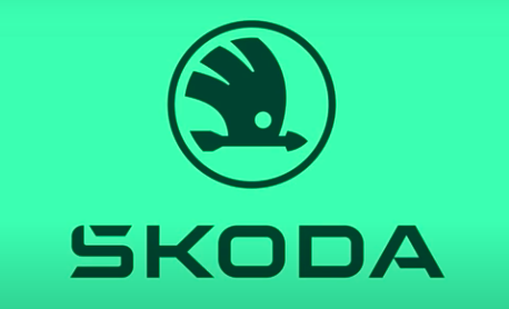
The Skoda wordmark was made more expressive and distinctive by working the accent mark over the S right into the letter. “The accent was a challenge for us: from a global perspective it tends to be confusing for most of our customers. In the new form, this symbol will be integrated and blend in with the symmetry of the logo, while customers in the domestic market and some others will still recognize it in the lettering,” says Martin Pavlík, a member of the marketing team that created the new brand identity.