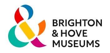
• Brighton & Howe is the only city in the UK that has an ampersand in its name. Design firm Baxter & Bailey took advantage of this unique attribute in a new identity for Brighton & Howe Museums. The client’s new logo is an ampersand made from six differently colored segments.
From a Creative Review article: “The ampersand logo is designed to represent the six venues that make up Brighton & Hove Museums. These comprise Royal Pavilion & Garden, Brighton Museum & Art Gallery, Hove Museum of Creativity, Preston Manor & Gardens, Booth Museum of Natural History, and the digital Discovery collection. It attempts to give all venues ‘equal recognition’, opposed to the old branding which only highlighted the pavilion.”
https://brightonmuseums.org.uk/
https://www.designweek.co.uk/issues/8-14-august-2022/brighton-hove-museums-rebrand/
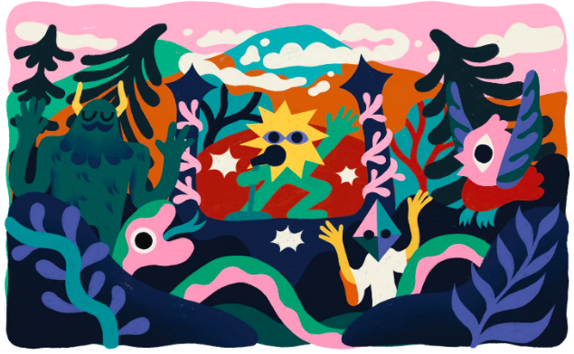
• For its 20th anniversary, the Green Man music festival will gather more than 25,000 fans in mid-August in Brecon Beacons, a mountain range in South Wales. In its 20 years, the festival has built a distinct brand that includes a custom font, screen-printing techniques, and distinct names and symbols for each of the 10 festival areas.
Illustrator Jess Hanningan built on that brand framework when she created the visual identity for this year’s festival, linking her art to the local flora, fauna, and legends of the area. For instance, Brecon Beacons State Park is an International Dark Sky Reserve, so it is also great place for star-gazing. Hanningan included plenty of stars in her work, plus a fantastic population of folkloric creatures.
https://www.itsnicethat.com/news/jess-hanningan-green-man-festival-2022-080822