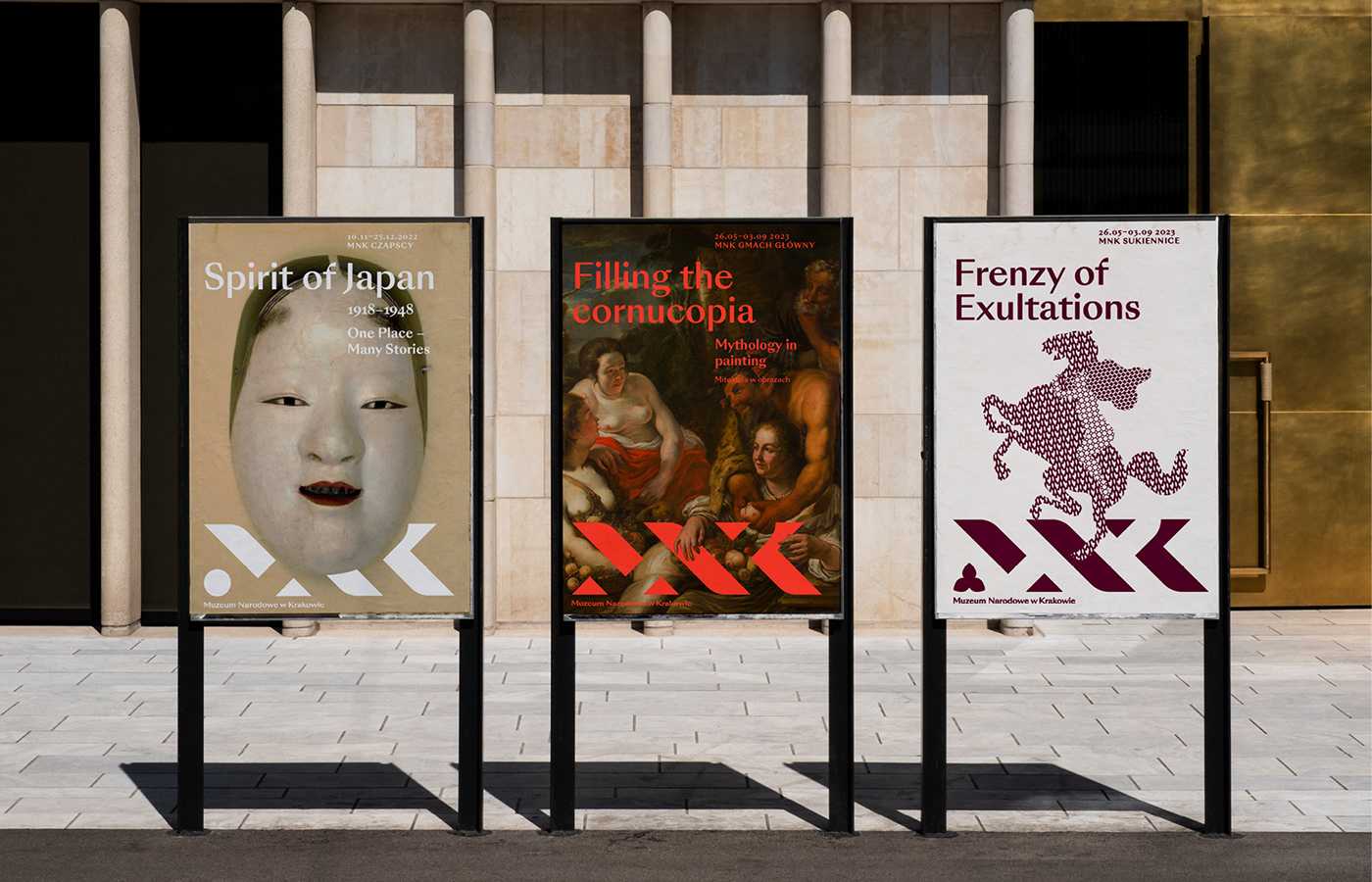
• The National Museum in Kraków is benefitting from a sophisticated new identity system created by design firm Podpunkt that is based on the concept of weaving.
From Podpunkt literature: “The new identity is based on the metaphor of weaving threads of inspirations and artworks into the vast body of art—as the basis and DNA of the collection. The symbol is timeless and abstract in its geometric interpretation of classical typography. It is a graphic rendering of the abbreviated name of the Museum—MNK.”
https://www.behance.net/gallery/168897377/National-Museum-in-Krakow

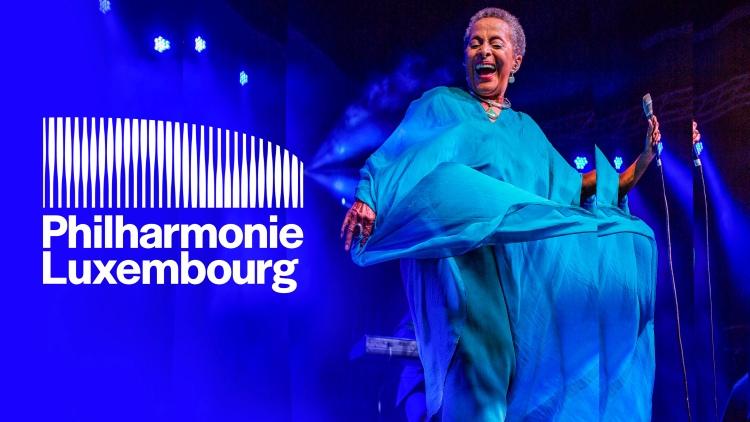
• NB Studio has created a new identity for Philharmonie Luxembourg that is based both on the architecture of the philharmonic’s building as well as on the behavior of sound waves. The static logo clearly spells out the connection between the building and what happens inside the structure, but the animated logo takes the concept further. In response to music, the design undulates and pulsates, giving even more depth to both the music and the logo.
https://www.designweek.co.uk/issues/15-may-19-may-2023/nb-studio-philharmonie-luxembourg-identity/

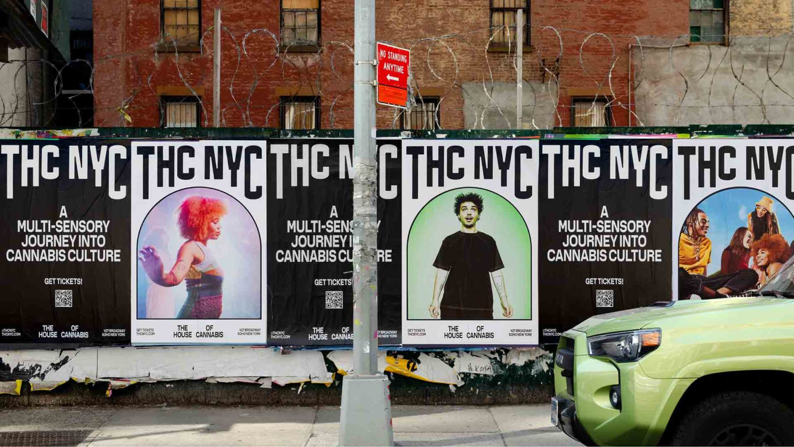
• THC NYC—The House of Cannabis New York City—has a new identity created by Base Design. The museum project presented a tricky proposition: it had to appeal to experienced users, newbies, and non-users. The iconic arch-shaped windows of the museum’s building sparked the logo. The shape suggests inspiration, a frame highlighting a moment in time, and/or a portal to a new experience.