
Oxsight creates glasses that help people with eye conditions that cause peripheral vision loss. Creating an identity for Oxsight was a challenge for several reasons. First, the target audience could have trouble actually viewing it, and second, the glasses and brand needed to be regarded as a style statement, not just a medical aid and its manufacturer.
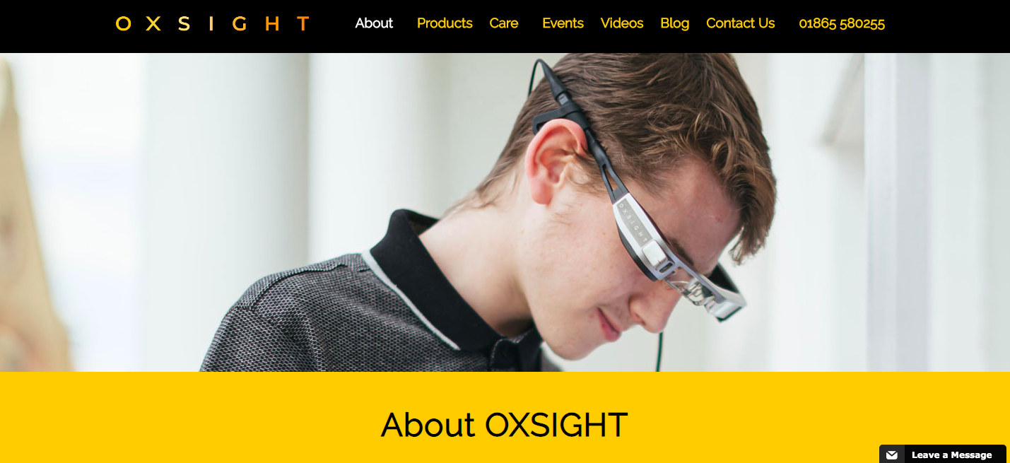
Brand strategy director Jeremy Duncan and his team at Reggie London used physical design attributes such as wide letterspacing and bright colors framed with black to improve legibility. But they also worked hard to avoid a clinical feel that such devices could easily engender. Style and sophistication were key.
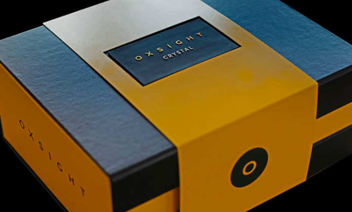 “Looks are just as important to a visually impaired person as they are to a sighted person. We wanted the glasses to be seen as a desirable accessory rather than just a functional medical device,” says Duncan in a Design Week article.
https://www.designweek.co.uk/issues/24-february-1-march-2020/oxsight-glasses-visually-impaired/