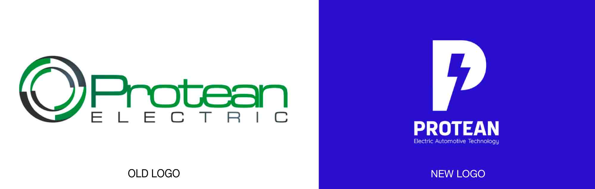
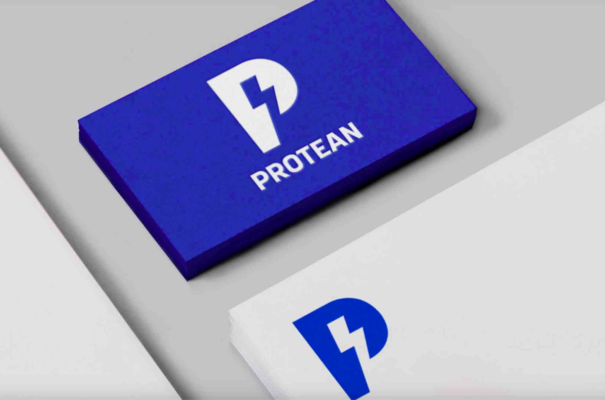
Protean, a developer of in-wheel electric drive systems, has a new identity that has finally caught up with the company’s technology, courtesy of Carter Wong.
Protean’s products, which are of both the automotive and technology worlds, weren’t served well by its previous branding, which vaguely suggested motion and environmentalism. The new designs stress the core nature of the business—electric drive—and it easily accommodates product branding as well. Gone is the eco-green, replaced now with an energetic blue. The color is used in all brand touchpoints, from the products themselves to print and social media. The new branding uses the Google font Montserrat.
Read more details here.