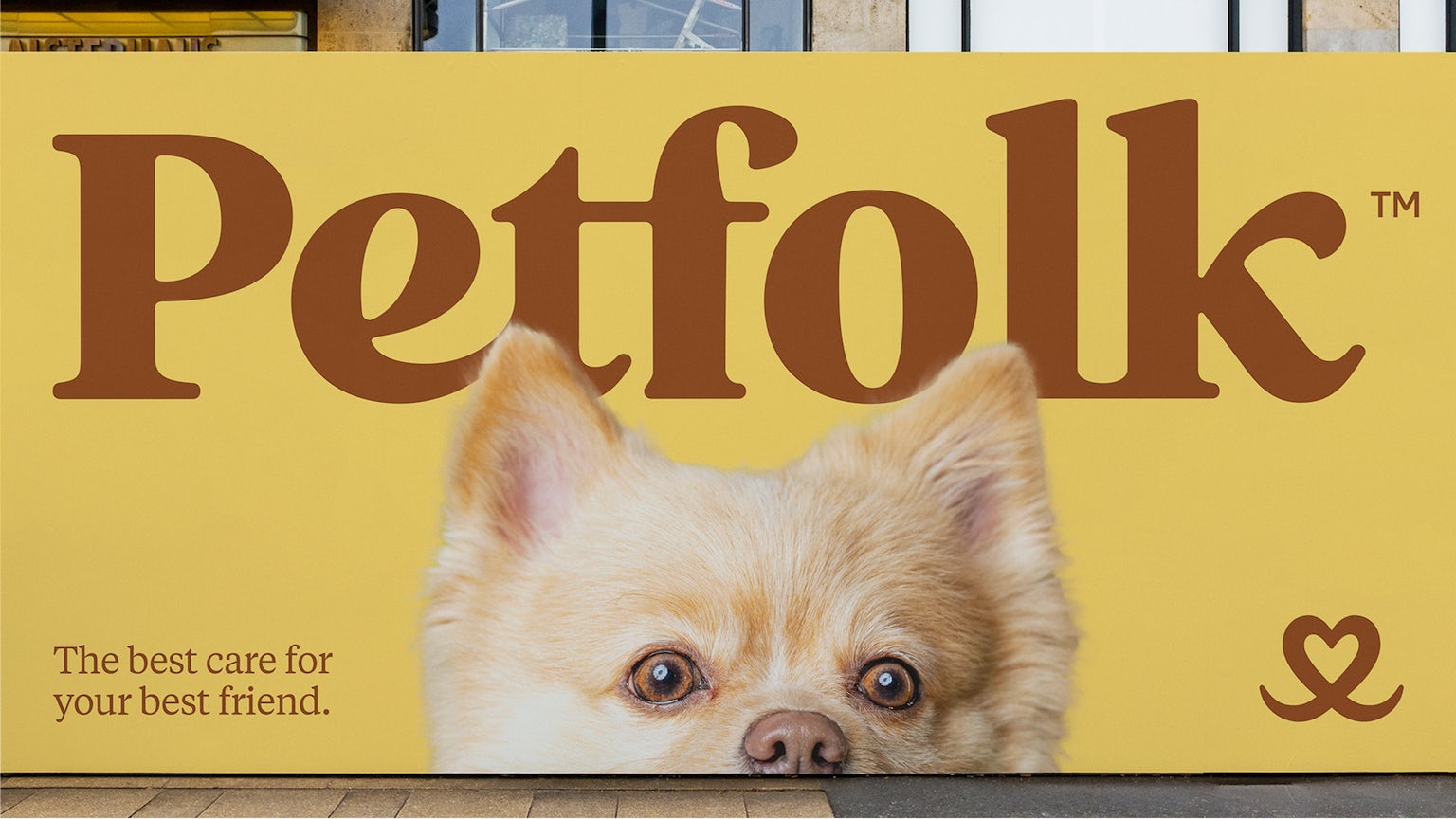
Design firm Zero avoided both clinical and cutesy directions in its new identity for Petfolk, which defines itself as a service that is “reshaping vet care for today’s pet parent.” The focus is on transparency and comfort through care, not clinical transactions.
The Petfolk logo mimics the shape of an animal’s snout with a heart shape at its center. The Petfolk wordmark feels friendly and almost huggable. The connection between the e and t subtly suggests the action of petting.