Syfy Reimagined
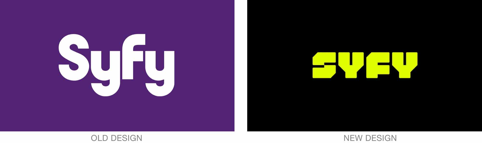
Loyalkasper has created a new identity for Syfy, the television station that specializes in fiction, fantasy, horror, and supernatural programming. Perhaps because of the wide range of programming it must represent, the new approach focuses on words and type instead of imagery.
This is a darker identity, often playing solid, all-caps, squared-off type against black or solid color. Syfy Bold and Syfy Sidekick were created to serve as the centerpiece to the “editorial first” system. The bespoke typefaces and new design are a definite departure from the previous, very curvy identity.
Read more here.
New identity for AICP
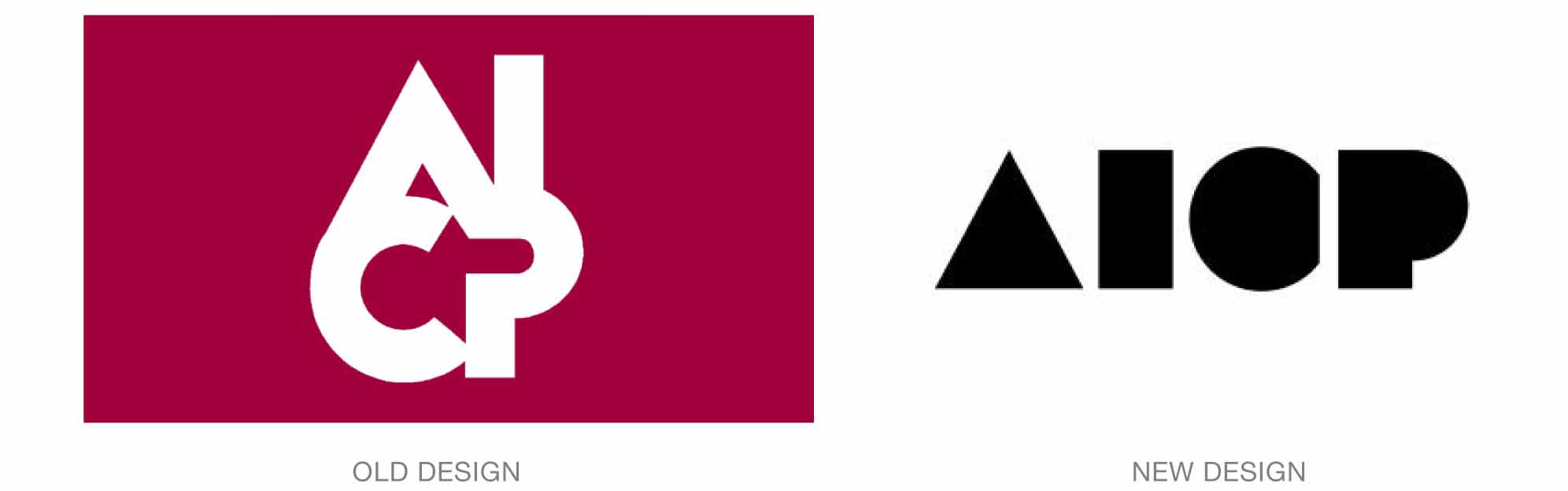
The Association of Independent Producers has a new logo, created in collaboration with the design consultancy Collins over a period of two years. The new design replaces what members called “the house,” which had been in use for 45 years.
Unfortunately, very little information regarding the new design has been forthcoming, so it’s difficult to gain any appreciation of it at all. It’s difficult to read, mainly because of the C, which could also be an O or G. But it seems likely that the dense shapes will be used as transparent windows through which members’ work and other visuals can be viewed.
For more details, see here.