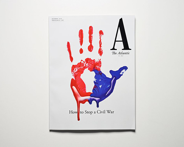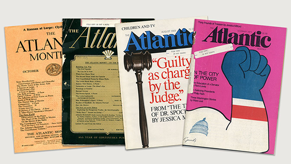
The 162-year-old magazine The Atlantic has a new visual identity that knocks its name down to just “A.” The interior of the magazine, as well as its website, have also been reworked.
Creative director Peter Mendelsund explains.how his team made the radical decision to use just a single letter: “When Oliver Munday, my senior art director, and I began rethinking the wordmark, we tried a number of angles, mainly finding ways to repurpose and redraw old marks from The Atlantic’s past. But the notion occurred to us that we would eventually need a mark that wouldn’t be so horizontal; in other words, a mark that wasn’t a word, such that it could fit in all of those confined spaces where, physical magazine aside, The Atlantic lives. Like on your phone, and on your social-media feeds, etc. It seemed obvious to us that what we needed was an emblem—a logo.”

https://www.theatlantic.com/news/archive/2019/11/introducing-new-look-atlantic/601762/