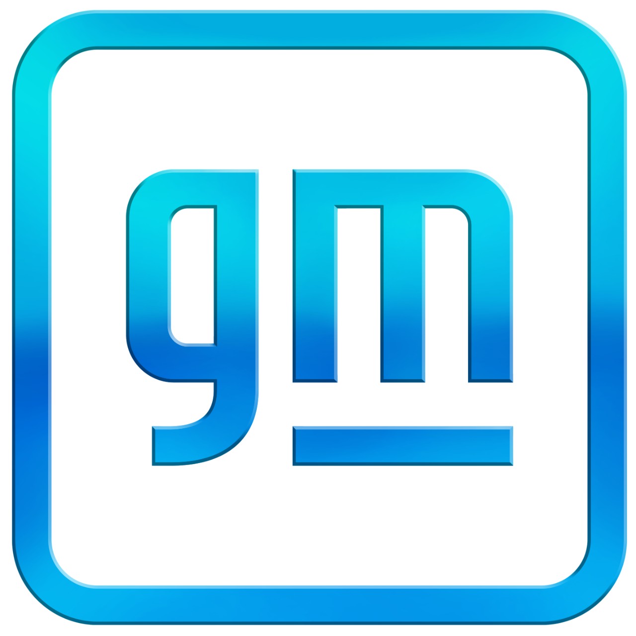
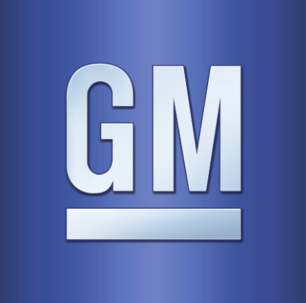
For the first time since 1964, General Motors has significantly updated its logo. The new GM mark has four main changes: the letters are now lowercased, the line beneath the letters is shortened, the enclosure shape is rounded off, and the entire color scheme is brighter. All of the changes are tied to GM’s focus on electric vehicles.
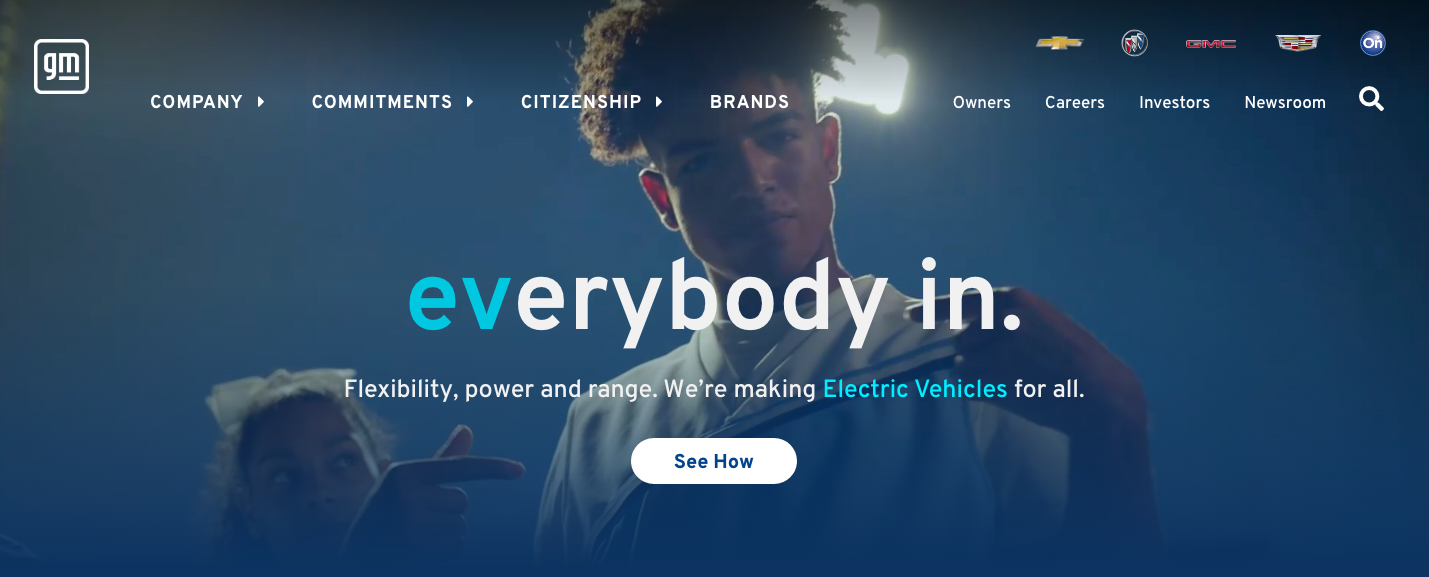
“Everybody in”— with stress on the EV—is center to the company’s new marketing, which focuses not just on younger consumers, but on the environmentally conscious of any age. The lowercase letters present a more youthful look. Combined with the abbreviated line, the letterforms create an electric plug within their negative space. The enclosure feels friendlier, but it and the line firmly tie the new identity to the old one. The fresher, lighter sky-blue colors underline the environmental benefits of electric vehicles.
The line element and color scheme are also repeated in the logo for GM’s Ultium battery, which will power the company’s fleet of electric vehicles.

(Kia is also out with a new brand identity, and it’s causing some raised eyebrows. Learn more at https://www.thedrive.com/news/38599/youre-not-crazy-heres-why-kias-new-logo-looks-crooked.)