Most board game players associate the iconic game Risk with the Napoleonic wars, but the game has seen many theme variations in its 60-plus years of life, including Castle Rock, Lord of the Rings, Rise of Empires, Nuclear Devastation Risk, and Zombie Hordes, just to name a few.
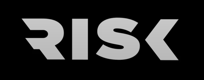
Toronto design agency Quake recently took on the challenge of creating a new identity for the game that could live both backward and forward in time. The new branding has nothing to do with flags, horses, or even the color red. Instead, the new wordmark is a clean, sans serif design where the R and K are cut off in a dramatic and very specific way.
![]()
“What’s great about the identity is it almost feels like it’s in conflict, like the beginning and the ending of the identity are pushing into each other,” says Quake founder Barry Quinn.
https://the-message.ca/2022/08/18/how-quake-created-a-new-brand-for-an-iconic-game/