Channel Tunnel operator Getlink, with the help of Landor & Fitch, has rebranded the Eurotunnel LeShuttle as just LeShuttle. The redesign was sparked by the need to help customers understand the difference between LeShuttle—which transports people inside of their own vehicles—and Eurostar—which provides high-speed passenger train service through the Tunnel.
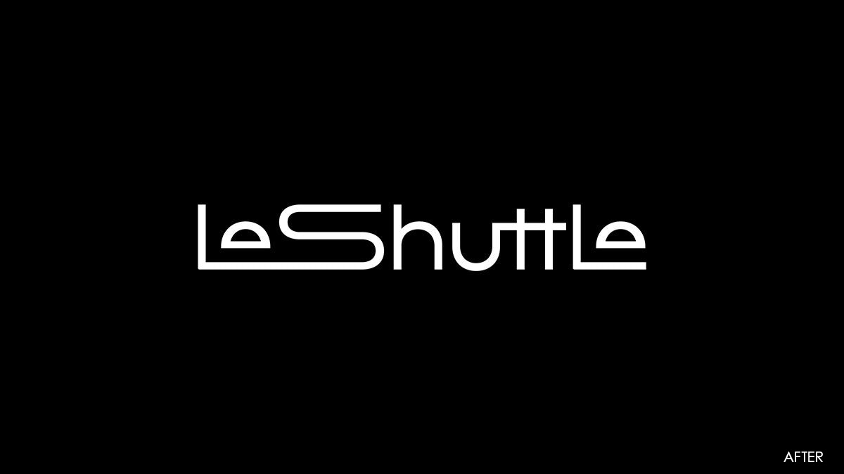
The new LeShuttle logo is sleek, suggesting speed and efficiency. The lowercase e’s in the name are transformed into two cars that are cradled inside of the train- or tunnel-shaped wordmark. The design visually represents LeShuttle’s actual service. (The e’s also resemble a tunnel opening.)
The full wordmark is easily abbreviated into a smaller monogram built from the letters L and S with an e/car resting safely inside. That same half-circle shape is repurposed in other graphics in the new system.
https://www.creativereview.co.uk/eurotunnel-le-shuttle-rebrand/