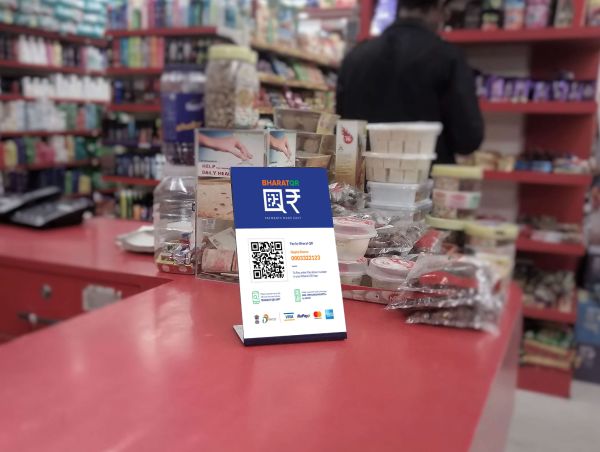
The government of India asked Landor to create an identity for Bharat QR, a quick-response, cashless payment system that is a collaboration between the four payment systems already operating in the country— Visa, Mastercard, American Express, and National Payments Corporation of India.
Simplicity was key to the project. Not only did its ease of use need to be evident, it had to appeal to peoples of many different education levels, geographical situations, and actual circumstances: a buyer could be paying for lunch in a restaurant or donating to a charity at a rally or paying a courier for a package delivery at a rural farm.
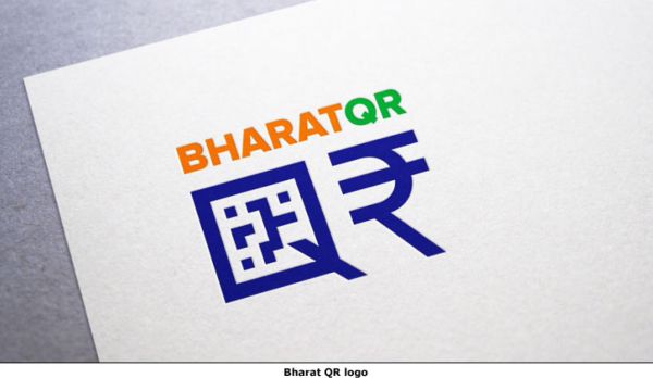
The new design is indeed very direct and approachable. Landor designers turned the letter Q into a square that referenced the QR square, and the R was represented by the already very recognizable rupee symbol. The colors in the new identity are those of the national colors of India—saffron, white, and green.
Read more behind the new logo here.